La Subida in Colio Wine Region of Italy

My travels to Italy took me close to the Slovenian border to a resort called La Subida. A beautiful family owned resort that resembled a mix of Scandinavian and modern simplicity. The photo below shows just how close the Slovenian border was - at the mountain range.  The closest town was Cormons in the heart of the Colio wine region. 

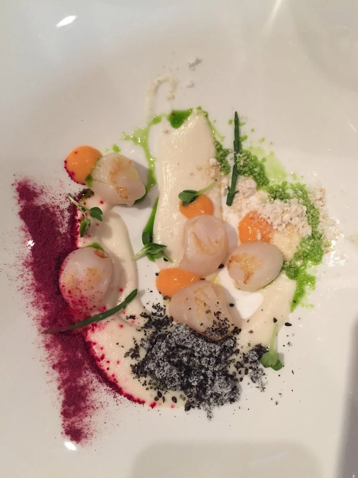
The food at the trattoria was divine! Being in the smaller towns of Italy was a real treat. The way of life is simple and clean. 

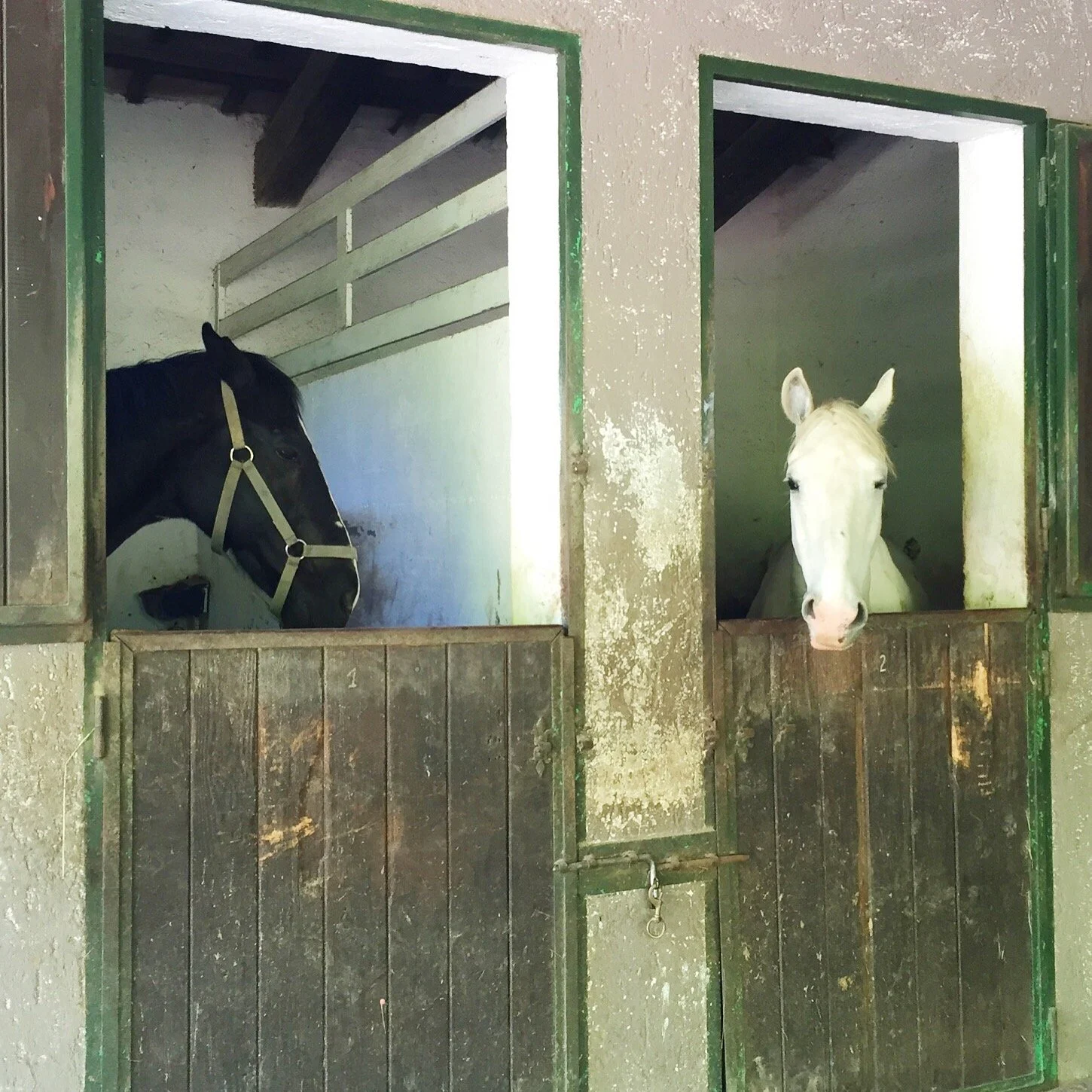
One interesting feature of the resort was the different experiences offered from sleeping in the barn with the horses under a crystal chandelier or bathing in a cast iron tub in the woods among the ferns. 

There was a main restaurant and a more causal spot near the pool. The decor was rustic and earthy. 

I would love to have this kitchen in a farm house. 

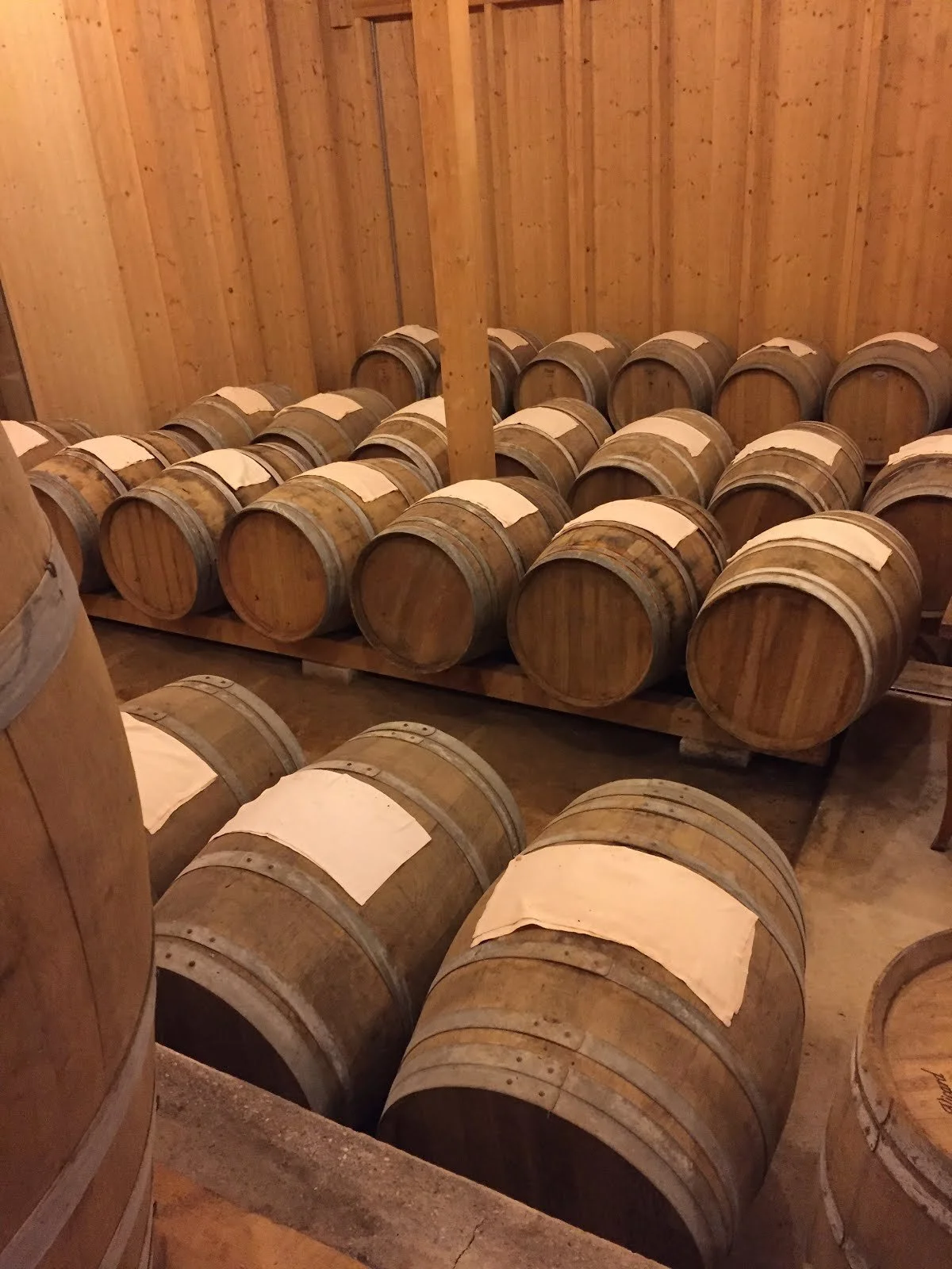
They make there own vinegar at the resort in a beautiful handcrafted building. 

The resort consists of individual houses - this one called the nest is a one bed room covered in the tree branches.

Most of the interiors of the other cottages had this raw Scandy feel. Lots of animal hides and natural stained wood.  Beautiful quaint spots for couples or families. 

Our dinner at the main restaurant was amazing - the local wines from Colio were a treat. Colio is more famous for its white wines than your typical Italian reds.

Hand carved meats and fried cheeses were among the culinary delights. Not to mention the 7 course meal at dinner! 

It has been a traveling year with a few more stops to come - Tulum, NYC, Chicago and Hawaii! 

Traveling to Italy!

Even though I have taken many trips to Italy I have never been to Venice. This past May I was able to correct that mishap and what a beautiful city it was. I had been warned of the smell, crowds, and flooding but I did not see any of that. I was amazed that it was so small from the air. Such a remarkable city to be surround on all sides by water.

Getting around by water taxis was interesting. Our hotel was on a different island so we were on those water taxis day and night. Luckily there were very handsome drivers!

Dinners at beautiful historic villas which open to wonderful courtyards inside their guarded walls.

Some images were just as I imagined...

We were introduced to Col Fondo Prosecco, unfiltered. Slightly salty and cloudy.

Amazing chefs and amazing food.

Just walking down the streets, every view was amazing.

Beautiful architecture

A visit to the oldest fabric maker. The women were using old fashion wooded looms to create fabrics that were around $1000 per meter. Amazing!

This is the home of the Scalamandre silk velvet tiger!

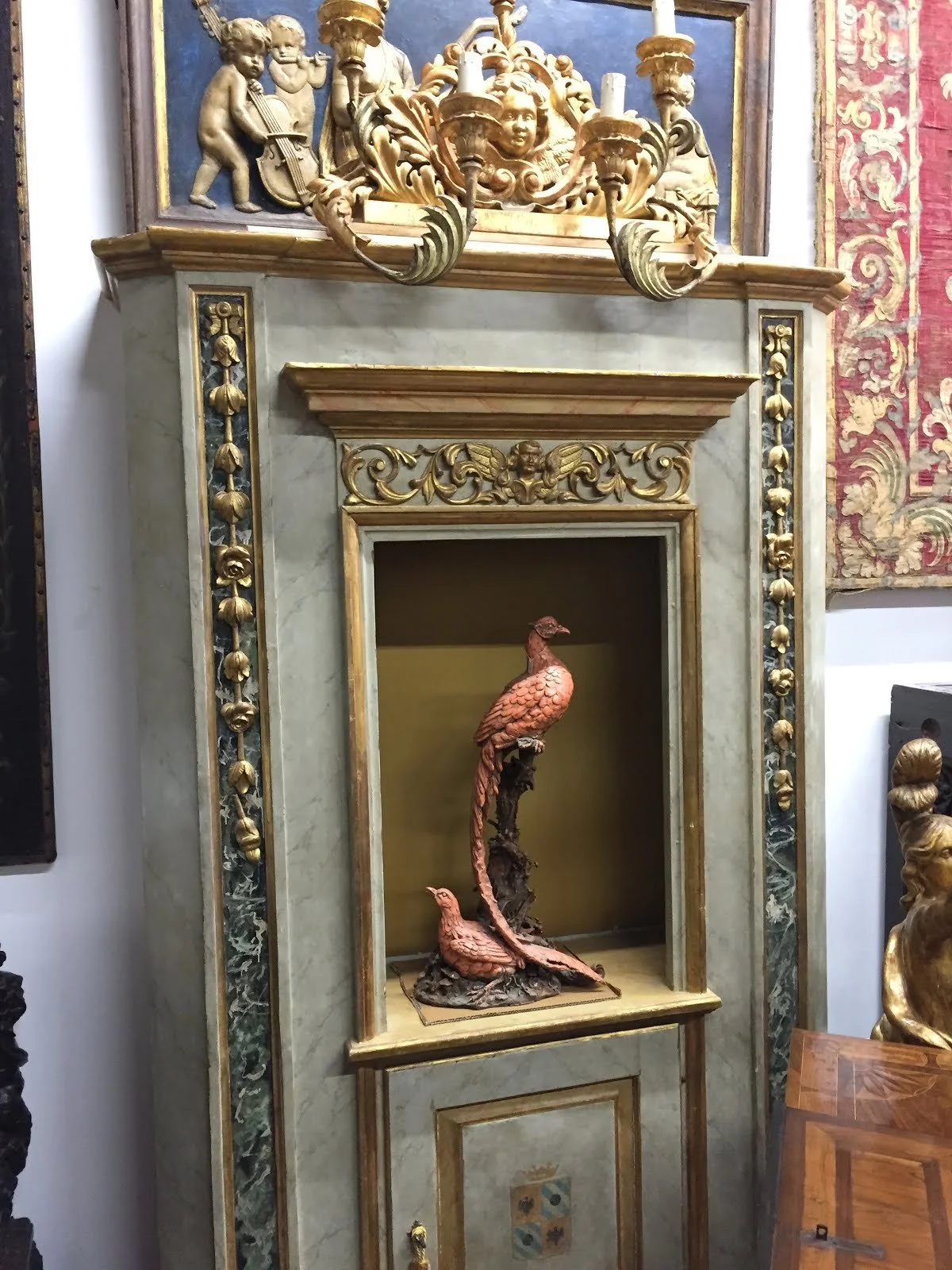
Antique shops that are within the dealers homes. Incredible finds from some of the most prestige old homes.

These Medieval columns were my favorite!

We never missed a meal or a glass of wine that is for sure!
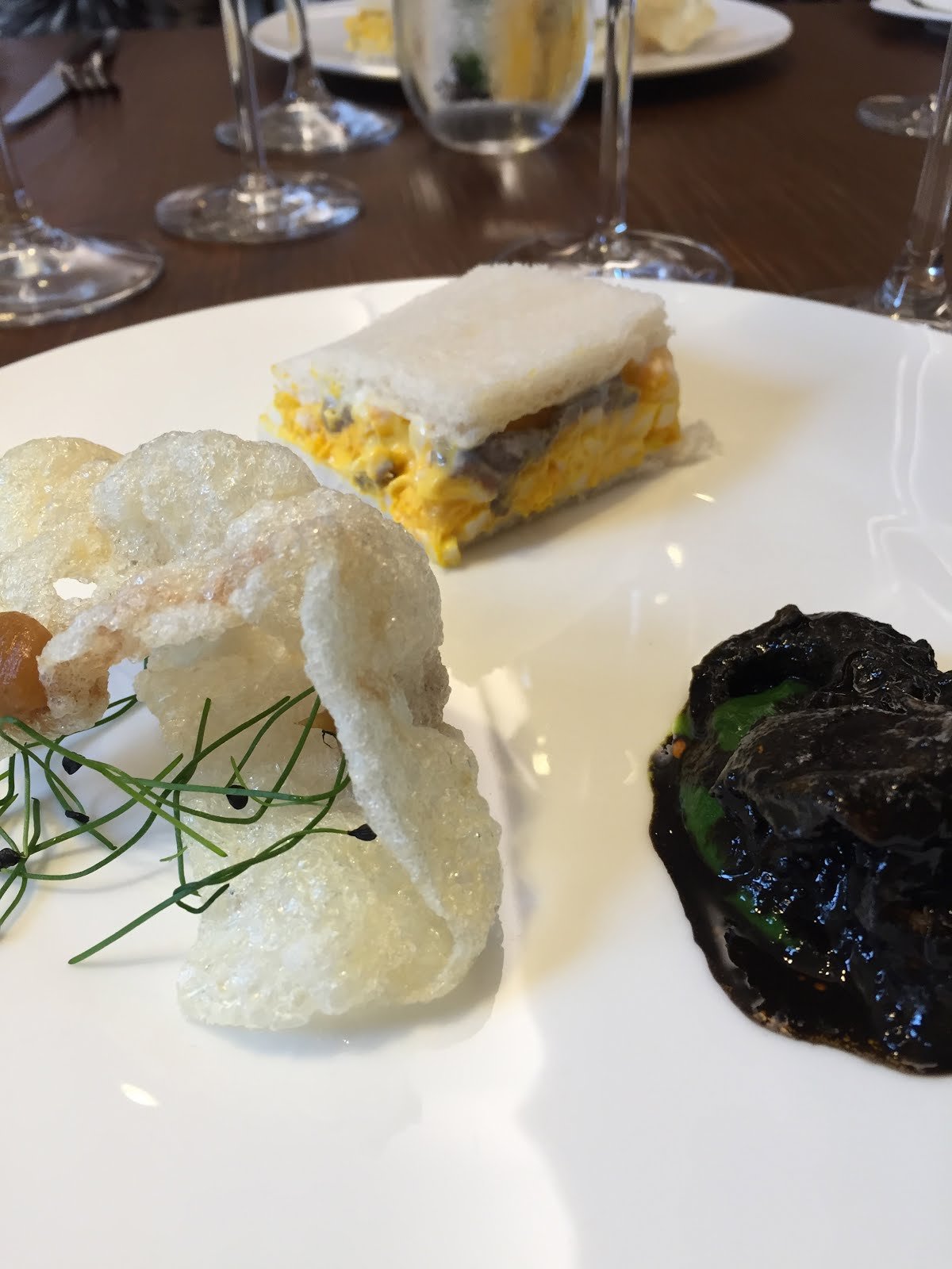
Local would be a restaurant not to be missed. I loved the Squid ink!

Off to Murano for the day! It is on one of the other islands. We brought a few things home.

Dinner at an Organic Winery on another island called Mazzorbo. The winery is called Venissa with grapes that were once almost extinct called Dorona grapes

Not only were the wines good, the food was amazing. Truly farm to table - fresh and flavorful!

Next it was off to the countryside outside of Venice …..

Anatomy of a Room: Southeast Style

In this Anatomy of a Room series we discuss what we love about a room and why it works visually and mentally. 

This is Barbara Westbrook Interiors and her Southeastern Atlanta Showhouse family room from this past April. 

Why this works!

1. Scale - perfectly proportioned photography by Whitney Ott. These dark still life images of colorful flowers are perfect to grab your attention as well as balance the high ceilings in the room. I love that there are no large furniture pieces underneath. They are set low in scale with the fireplace. 

2. Interesting Groupings - the custom chaise grouping with the metal stools, Sofa with pouff ottomans, and wing chairs by the fireplace. It is hard to make too many pairs work but here it does. 

3. Black and White Color Scheme - It works here because of the boldness of the stripe and the art. It anchors all the linen and white walls

4. Mixing Accessory Styles - love the medieval iron work, French stucco fireplace, modern take of Flemish still life art, Hollywood Deco Black and White, beautifully crafted antique tables and ceramics. 

5. Whimsy - Sconces made from old tin plates. Graphic and large in scale. The room felt easy and comfortable even though the ceilings were two story. 

I hope you had a chance to see this room in person. It was amazing! 

( photo from French by Design )

Happy Designing…..

Bridget Beari Travels to Las Vegas

Private Tour of the Wynn Hotel

What a treat to see all of the public spaces and many of the private spaces at the Wynn Hotel Las Vegas. Roger Thomas and his design team created incredible spaces throughout the hotel - uniquely creative restaurants, intricate tile butterfly mosaic floors, custom red Venetian glass chandeliers, floating parasols, 2 story glass views from the $40K per night suites and more. It was all so exciting to see. Thanks to Modenus Blog Tour KBIS and Jackie Von Tobel, a resident designer in Las Vegas.

Here are some of the highlights:

Floating parasols that moved up and down! The colors were amazing

Custom red Murano glass chandeliers

Beautiful tiebacks and drapery

The details were incredible. Check out the moldings. Nothing is ordinary.

One of the many bar/nightclub spots

The ladies room at the night club  - marble everywhere!

A stunning restaurant all in gold, white and emerald green. All the passmenterie was custom made by Samuel and Sons.

The layering of pattern was amazing and so well done. This is a ceiling pattern - moire, floral, mother of pearl, damask, solid gold.

Every detail is designed - even the tableware, linens and flatware.

Tented ceiling treatments 

Bold colors and trims

The wedding chapel - beautiful embroidery on the padded wall treatment

 I loved the custom elevator doors - each one more interesting than the next.

Such a special treat to see all of these unique spaces.

Happy Travels.....

Anatomy of a Room: How to do Moroccan Right

I love the idea of layering in a room and nothing is more layered than a Moroccan styled room. Some designs over do the causal style and the motifs but some use those elements in a sophisticated brilliant way, almost a purposeful chaos.

One of the best designs is by Gordon Stein in a house called Casbah Cove in Palm Desert California. The architecture is loaded with Moroccan styled motifs and shapes but the style is still casual and open.

Love this ceiling

(photos from Numvo)

There are many details in this room - caning on the cornerstones, slated ceiling, multi color tiled walls, marble floors, carved doors but notice how it is the white color of the walls that holds the room together.

(photos from Numvo)

This gorgeous bedroom with the repeated shapes in arches and wall treatments, chevron floor, teardrop rug, and round light fixture. Brilliantly balanced with high contrast of black trim on the windows. 

(photos from Numvo)

Love the skylights and the eternity arches in the mirror.

(photos from Numvo)

The skylight shape is repeated on the doors but done in white on white. With 3 different arch motifs in one room - pointed arch, rounded and stretched out, one would think that it was over kill but the subtle nature of the design helps pull the layers together.

Rules are definitely made to be broken if done with the architecture and the proportions of the room in mind.

(photos from Numvo)

Typical of Moroccan design is the multi tile mix - color and pattern but here the brown wall anchors the colors on the floor so they shine strong but grounded.

(photos from Numvo)

A little more traditional in design but the shaped on the fireplace is beautiful.

(photos from Numvo)

Again patterns, colors and architecture combined in the grotto.

(photos from Numvo)

A beautiful courtyard with perfect proportions in the height of the house and the trees against the arches.

(photos from Numvo)

A detail of the powder room. I can't tell exactly what the sink basin looks like but maybe just perforated holes in a marble top?

(photos from Numvo)

Obviously that house had a huge budget but here are some ideas for layering that could be done in your own home.

1. Mixing styles - traditional artwork within a casual room setting

2. Neutral pillows in heavy cotton fabrics and of course down fills

( photo from French by Design )

3. Architectural arch designs

4. Everyone loves a good day bed

( Photo from Interiors by Krisnalila)

5. Grouping lighting elements

6. Multi patterns of pillows or tiles anchored with white

( photo from Justdecorate)

I missed my chance to travel to Morocco in January of 2016 but I hope to get there one day to see these design elements in their natural setting.

Until then we can dream and create!