Hue Are You? with Lisa Mende

Hue Are You?

Designer Spotlight: Lisa Mende

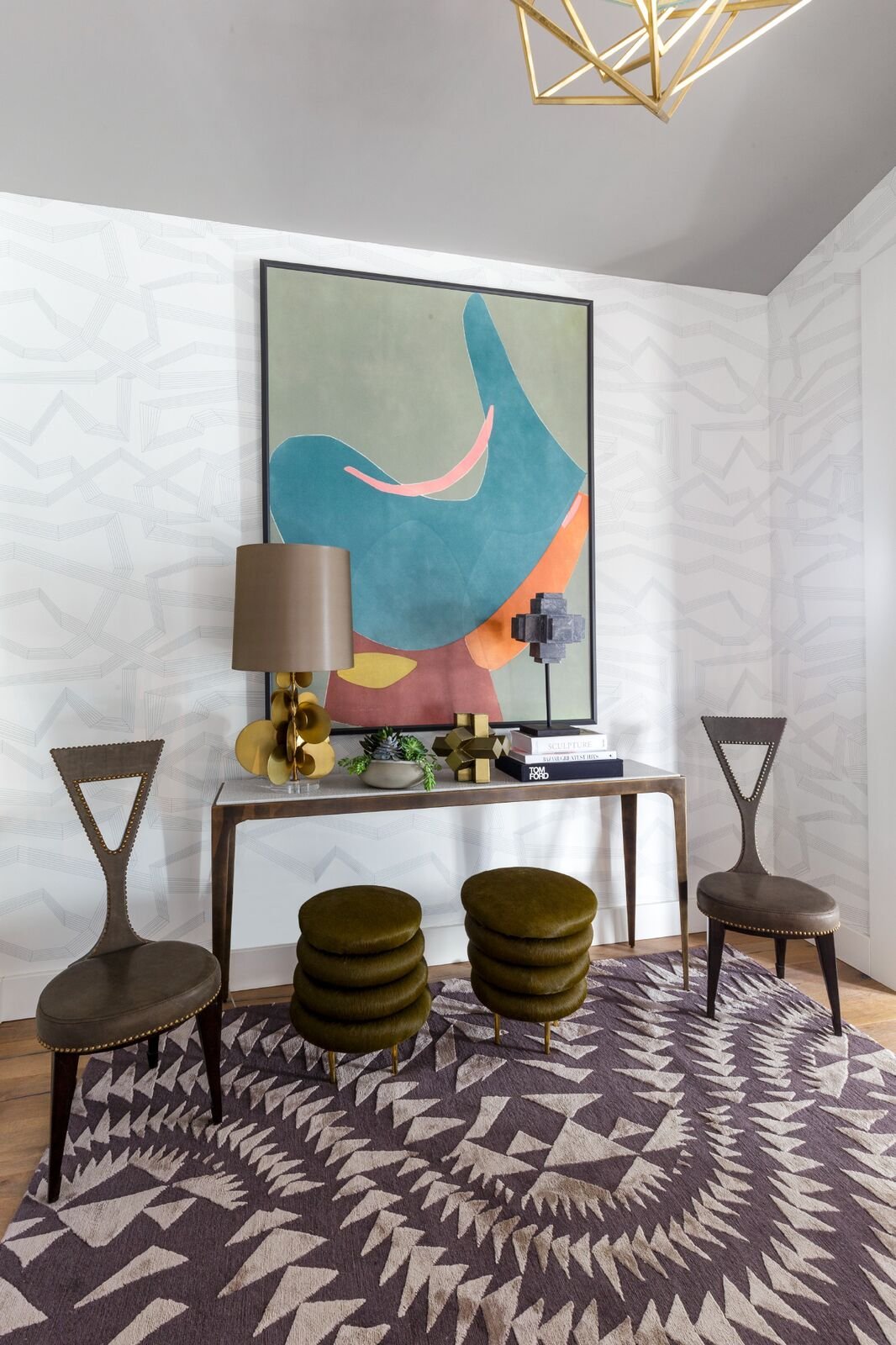
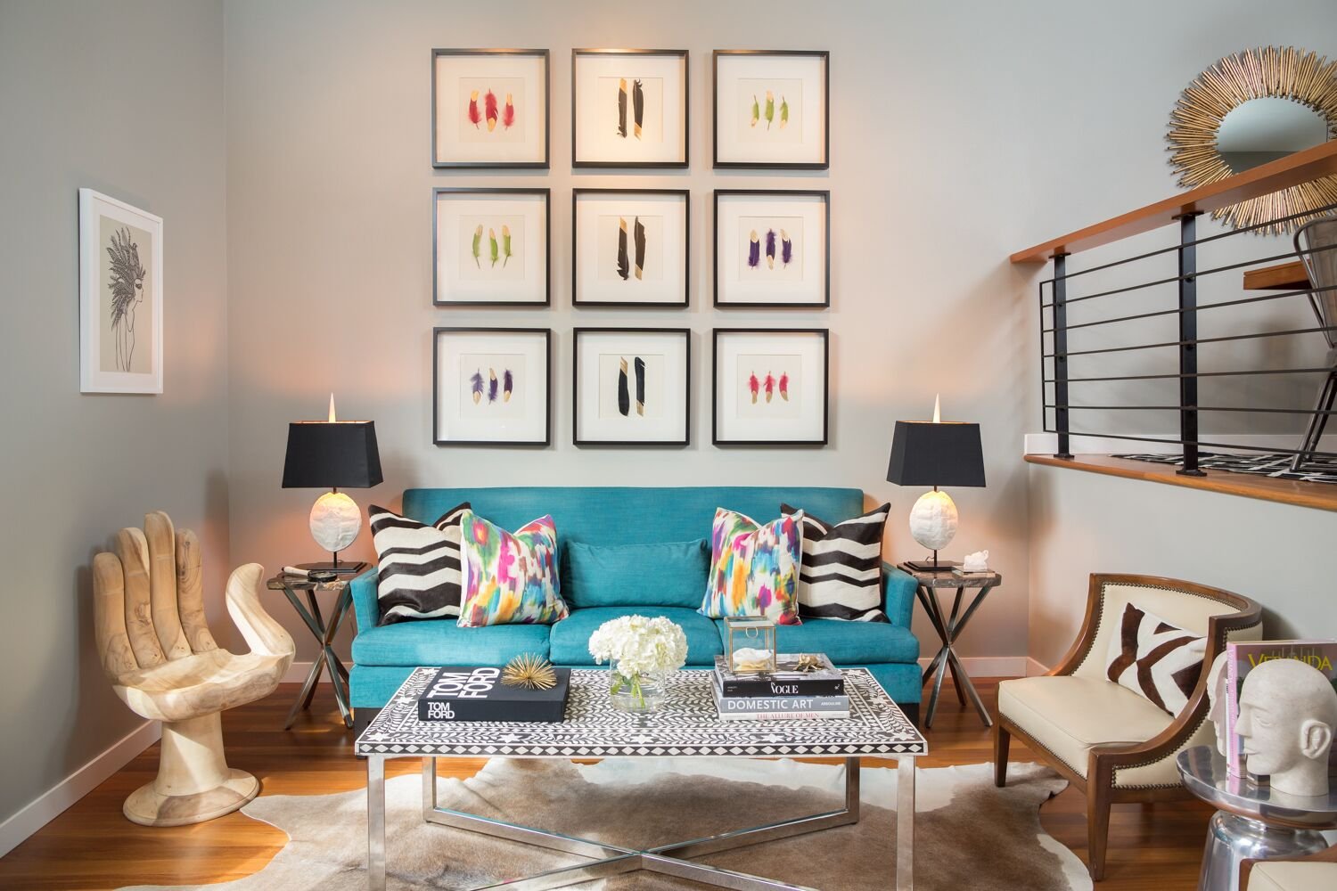
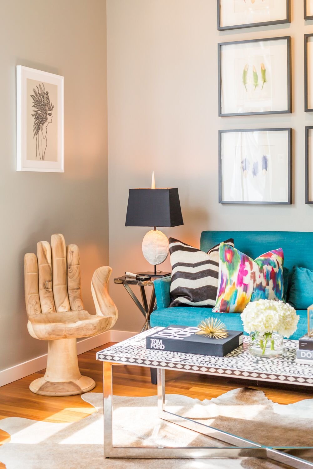
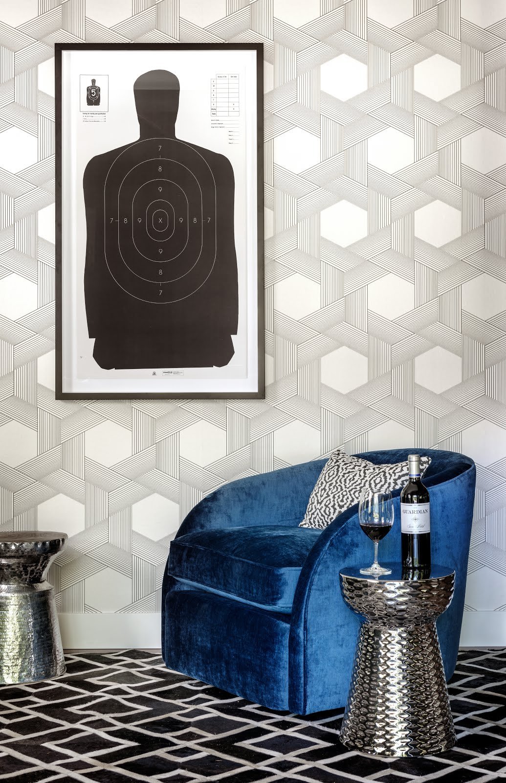
Known for her bold use of color, Lisa is an obvious choice for my color series. She is an interior designer from Charlotte North Carolina but also a blogger with a large social media presence and a brand ambassador for leading industry products like Rohl faucets. Lisa's Traditional Home Showhouse kitchens from Greensboro and Savannah are stand out projects that show her creative use of function, color and design. Full of life and energy is both Lisa and her projects. Here is her take on color - how she uses it and how she selects it!

Photo by Stacey Van Berkel

Susan Jamieson: What one color represents your design style?

Lisa Mende: Aqua, I love aqua and it always finds a place in my designs if the client is willing. It is a happy color and reminds me of the ocean.

Photo by Kelli Boyd

SJ: Do you use color as a dominant role in your designs or as an accent?

LM: Honestly, it depends on the client more than on me. If they are willing to let me use color, I go for it. If the client doesn’t like a lot of color, I use it in restrained ways such as accessories or pillows.

Photo by Christa Wedge

SJ: How do you feel about matching colors in a room?

LM: I always go for the blend. Like nature I find it more interesting.

I ENJOY WORKING WITH MY CLIENTS TO CREATE A HOME THAT REPRESENTS WHO THEY ARE.
— LISA MENDE

SJ: What color represents your personality?

LM: Fuschia! It was my favorite color as a child and the first crayon I pulled out of the box. I think I’m a happy person and fushia always brings a smile to a girl’s face. It is a grown up pink!

Photo by Dustin Peck

SJ: What color comes to mind when you talk about:

Your favorite city ......

LM: Paris - Pink

The house you grew up in .......

LM: Newton Grove, NC - Blue

Last fabulous dinner you had .........

LM: Ralph Lauren in Paris - black

Your favorite flower ..............

LM: Peony - Pale Pink

Your favorite season .............

LM: Summer - Aqua

Your favorite piece of art ...............

LM: My Daughter’s portrait - Pale Blue

Your favorite room in a home ............

LM: The morning room - pink

Your favorite beauty product ..............

LM: Cle’ de peau - Concentrated brightening eye serum - Silver

Your favorite article of clothing .........

LM: My aqua/green - Hermes wool challi scarf

SJ: Name a color you never use?

LM: brown

Photo by Marco Ricco

SJ: Name a color you use frequently?

LM: black

TRADITIONAL HOME GREENSBORO SHOWHOUSE
Photo by Dustin Peck

SJ: If you could pick a name for a color what would it be?

LM: Happy Blue. My nickname with my nieces and nephews is Happy so I would create a color that was almost aqua and almost cerulean blue and name it Happy Blue.

DXV BREAKFAST AT TIFFANY'S INSPIRED BATHROOM AD

SJ: Do you have a pet?

LM: 2 actually, a yorkie named Oliver and a Welsh Terrier named Wrigley.

SJ: What color reminds you of him/her?

LM: black/tan

Photo by Emily Followill

SJ: Do you have a nickname for this pet?

LM: Ollie and Mr Bigs

MY SIGNATURE STYLE IS CAUSAL LUXURY WITH A DASH OF DRAMA
— LISA MENDE

SJ: What is the now Neutral?

LM: white

SJ: What is your prediction for the next big color trend?

LM: Yellow is making a big comeback.

BUY THE BEST FIRST AND YOU ONLY CRY ONCE!
— LISA MENDE

SJ: What are the best color combinations?

LM: The ones that mimic nature

Photo by Marco Ricco

SJ: Best advise when it comes to picking paint colors?

LM: Look in your closet for your favorite colors you wear

Hue Are You? with Jaime Derringer

Hue Are You?
Artist Spotlight: Jaime Derringer

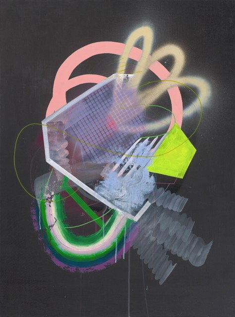
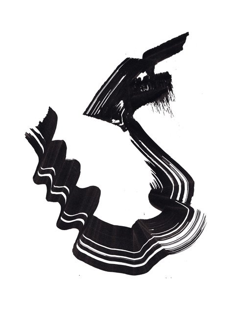
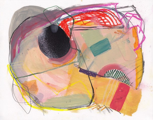
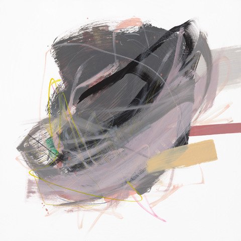
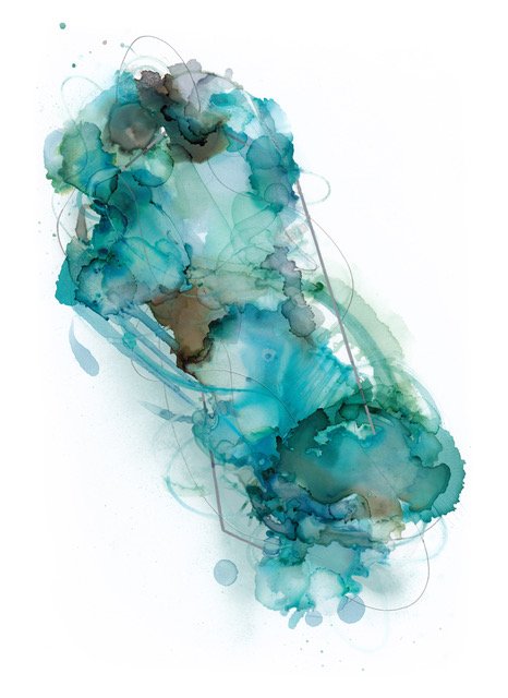
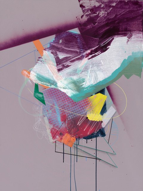
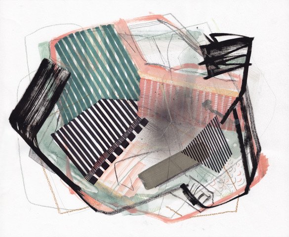
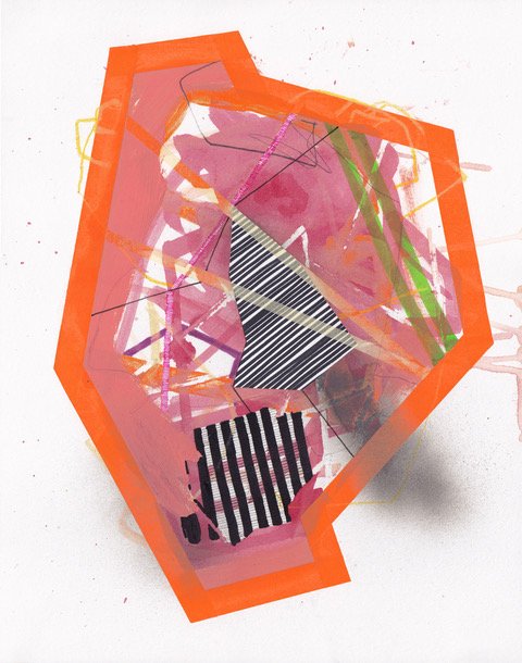
Jaime is the brain child behind three successful blogs, Design Milk, exploring the work of design and art, Dog Milk - a blog for dog lovers and Adorn Milk - an online jewelry store. She also creates the most amazing pieces of art. The art is an exploration of shape and color, using layering as a guide. Everything is unplanned and completely intuitive—each mark is a response to its predecessor. The repetition of shapes and lines is an exercise used to escape from everything else around me. She approaches each piece as an experiment. Her work is inspired by Japanese calligraphy (Shodo), graphics and style from the 80s and 90s, electronic music, celebrations/parties, fireworks, space exploration and sci-fi, undersea creatures, topography, cartography, plated food, and architecture. Let's learn more about Jamie and her thoughts on color.

photo by Noa Azoulay / featherlove.com

Susan Jamieson: Can You Tell Me More About Design Milk and Dog Milk?

Jaime Derringer: I started Design Milk because I was at a job that I liked , but I felt a need for a creative outlet. I also started drawing that year- it was 2006. I was looking for sofas for my house when I started to see lots of cool, modern products for sale online and simultaneously I discovered blogs. I had previously had an online an online journal and another failed online magazine, so I took of the things I loved- furniture, art, design , writing and publishing - and brought them together . I started it solely for myself, and for fun, but it started to grow organically within the first year. That's when I started considering the idea that this thing could have legs - the rest is history!

In 2011 I started Design Milk because I was getting a lot of modern dog product submissions over at Design Milk, and also I have two dogs, so I relate to dog owners who were looking for modern dog products. I looked around and nobody was writing about modern dog products so I decided to do it myself.

SJ: Why Call It "Milk"?

JD: Milk has Vitamin D .... D for Design!

SJ: What One Color Represents Your Artistic Style?

JD: Black

SJ: Do You Use Color as a Dominant Role In Your Art or as an Accent?

JD: Accent

SJ: How Do You Feel About Matching Colors?

JD: Matching feels like an outdated term for color. I always try and create a space or painting that feels good in my eyeballs... however there are times when I use color in paintings to create drama, dialoque or discomfort.

SJ: What Color Represents Your Personality?

JD: Black

IT’S BEEN A LONG ROAD OF LEARNING ABOUT CANVASES, DIFFERENT KINDS OF PAINTS, BRUSHES,TECHNIQUES AND I’M STILL LEARNING EVERYDAY AS I GO.
— JAIME DERRINGER

SJ: What Color Comes to Mind When You Talk About:

Your Favorite City .........

JD: Los Angeles - Milennial Pink

The House You Grew Up In .....

JD: Gray - lots of Gray

Last fabulous Dinner You Had .....

JD: 4 Saints in Palm Springs - brown and green - leafy, earthy, and musky

Your Favorite Flower .....

JD: Orchid - Purple

Your Favorite Season ....

JD: Spring - blue and green

Your favorite piece of art ..........

JD: A rainbow – everything by Frank Stella! King of color.

Your favorite room in a home ...........

JD: The bedroom is my favorite room because I love to sleep. I always think of bedrooms as calming, but they don’t have to be beige. I think of white when I think of bedrooms beause I love crisp, white bed linens. I believe they are the perfect blank canvas for vibrant dreams.

Your favorite beauty product ......

JD: Beige – ha. BB cream sheer coverage with SPF that is literally the color beige.

Your favorite article of clothing .......

JD: I love a good sweatshirt hoodie – cosy, warm, soft, loose. I have one that’s a light teal color that I practically live in.

SJ: Name a color you never use?

JD: Red – I have a hard time with red. It’s very demanding.

SJ: Name a color you use frequently?

JD: Black, also pink.

SJ: If you could pick a name for a color what would it be?

JD: Oh gosh that’s an impossible question! I am no good at naming things. I’d probably just call it something silly like Black Velvet and then chuckle to myself when people get that song stuck in their head.

SJ: Do you have a pet? What color reminds you of him/her? Do you have a nickname for this pet?

JD: Yes – I have a Boston Terrier named Chicken and she is black and white. It’s funny because she coordinates with our décor!

SJ: What is the now Neutral?

JD: Greige

I LOVE DISCOVERING COLOR PALETTES ONLINE AND COMPOSITIONS ON INSTAGRAM.
— JAIME DERRINGER

SJ: What is your prediction for the next big color trend?

JD: I’m not quite sure yet – could be soft sage, peach, maybe brown even. Something that was popular in the 90s but a bit more updated.

Jaime’s Handles:

Design-milk.com
@designmilk
facebook.com/designmilk
Instagram.com/designmilk
Pinterest.com/designmilk

@jaimederringer
Instagram.com/jaimederringer

Hue Are You? with Meredith Heron

Hue Are You?
Designer Spotlight: Meredith Heron

Ever met a redhead that is full of life, confidence and verve. Well of course but you have never met this redhead who is a bold and fearless with her color palette and its use in interiors. I don't mean crazy wild with color but calculatingly bold. She is Meredith Heron from Meredith Heron Design in Toronto Canada. Both a renown designer and a past host of an HGTV design show, Meredith pours her passion into every design project whether she is working in NYC, Naples, a lakehouse or a ski chalet. I can't wait to hear how she works her magic with color so here it goes .....

Susan Jamieson: What one color represents your design style?

Meredith Heron: WOW! Tough, tough, tough answer to give. I had to ask my team and they are a bit stumped too because I embrace colour so fervently in our work.

Indigo is my go to Neutral because it is universally flattering. I also use a deep Mallard Green (which has a ton of blue in it) as my other MUST use colour. I painted my husband’s office in this rich hue and am about to do a high gloss kitchen in it. I look best in jewel tones so I tend to design around these - does that make me incredibly vain or do I play to my strengths at work and in fashion? On the flip side, I am pretty passionate about certain pastels. I love a Smoky Iris - not blue, not grey, not mauve but a healthy mix of all three. And I use certain shades of blush as a power colour - again universally flattering, paint it on a ceiling and BAM you don’t need that plastic surgeon just yet.

“ I SEE MYSELF AS A STORYTELLER, CLIENTS HIRE ME TO WRITE THEIR BIOGRAPHY BUT NOT WITH A PEN BUT RATHER I WEAVE THEIR STORY THROUGHOUT THEIR HOME “
— MEREDITH HERON

SJ: Do you use color as a dominant role in your designs or as an accent?

MH: I’m known for using colour - a lot of colour but I’m judicious in it’s application/allocation. I love for example, to use colour on my custom millwork, especially in a high gloss lacquer and I routinely paint the room out to match the colour of the millwork to make the room feel bigger - tricks the eye when you don’t see stops and starts. I also use bold colour/patterned marble on as many surfaces as a client will let me. Wallpaper too is usually a statement making aspect of a room’s design in my world and fabrics all have colour and pattern in abundance. However, many of our rooms are paler walls with colourful fabrics or my custom area rugs. Artwork too is often where we bring a huge dollop of colour. So I don’t think I use it as an accent per se because our colour choices are very deliberate and bold but they don’t necessarily hit you over the head as soon as you walk into the space. I really enjoy designing rooms that reveal themselves to you, layer by layer each time you visit. You get more from the subsequent visits… love a room with a few secrets too.

SJ: How do you feel about matching colors in a room?

MH: I am a woman and a designer with many opinions that I’m not afraid to share and one of these is that I am religiously opposed to Matchy Matchy. I go out of my way to purposefully and skillfully UN-match colours in a room. They relate, they have to, but if all the shades of green in the room are the same, the room feels fake, forced and well amateur. Nuancing a colour palette in the room is a lot like nature. If you look out your window you’ll see hundreds of variations of green and they all work together. Knowing which ones to combine in a room together and how that combination will play out as your eye drinks in the room is a skill. I have it. I also go out of my way to include what I call “Some Ugly” in a room. Again, it’s a tactical decision to break up a space that looks too perfect, too in unison - I want some tension. That’s what makes a space feel lived in and fully appreciated.

MY POINT OF VIEW AS A DESIGNER IS THAT OF A STRONG FEMININE - IT IS MAXIMAL. MORE IS ALWAYS MORE.
— MEREDITH HERON

SJ: What color represents your personality?

MH: I’m a redhead - you want me to just pick one? If I wear Cobalt or Emerald green I am stopped in the street by strangers to comment on how striking my outfit is. I’ve also learned to embrace that I look good in an Acidic Citrine too - I always thought any variation of yellow was verboten for me but I was proved wrong. Same with Fuchsia. I tend to prefer cooler hues though. My living room used to be accented with Pomegranate and Blush but it was too warm for me so I switched it to Smoky Iris, Citrine and a deep mossy green with cobalt lamp shades in my foyer and that feels decidedly more like me.

SJ: What color comes to mind when you talk about:

Your Favorite City .........

MH: I love Rome and Florence - when I think of Rome I think of Putty - the colour of stone walls and Florence I think of the green in the Duomo.

The House You Grew Up In .........

MH: I moved A LOT as a kid but I always remember this Palm Frond Wallpaper my mom had in our kitchen. It was mossy green on white. Ironically I have a Palmetto Palm wallpaper in my foyer in black on white that is SO much like this paper my mom had. You do become your mother it would seem.

The Last Fabulous Dinner You Had ...........

MH: We had the best meal of our lives in Hakone, Japan at Nobu. I mean it was mind blowing. I think of a Japanese Maple Leaves - that burnt red. We arrived in the middle of a typhoon and when we left, the rain had stopped and the trees were all lit up. It also reminds me of Tuna Sashimi - OBSESSED.

Your Favorite Flower .............

MH: Lilies are my favourite flower for their smell and I love to include them in client reveals because the scent is so evocative and happy to me. I prefer the citrine ones that are a white/yellow/green ombre.

Your Favorite Season .............

MH: I used to think Fall was my favourite time but it may now be spring. I love when the deep violet Irises come up on our lawn or my clematis comes back to life. I’m so proud that I have enabled the clematis to thrive and each year when it comes back I’m so proud.

Your Favorite Piece of Art ...........

MH: My husband and I both are photographers and we travel a lot so for sure our own photos are my faves - we have a huge photo of our son Luke when he was 3 blown up in our dining room. It’s a shot I took when he was in the Atlantic Ocean and all you can see is his white blonde curls and this cobalt blue plaid shirt he had on which stands out against the grey sand and the rushing water of the ocean.

AT MEREDITH HERON DESIGN WE CONSPIRE TO EXCEED EXPECTATION
— MEREDITH HERON

Your Favorite Room in a Home .........

MH: I never have a fave room going in to a project. To me the favourite room reveals itself to me at the end of a project - kind of the way you know which wall feels right to have your bed against. As for having a favourite project/room that we’ve done - that’s like picking which kid you love the most. I’m always thrilled with Navy or Deep Green rooms though. If you want a deep saturated room design, I’m your girl.

Your Favorite Beauty Product ............

MH: I have this miracle mineral spray exfoliator that literally removes your face and gives you baby fresh skin (I’m not using it at the moment because I just returned from Mexico and I have a tan that I’m trying to keep!). It’s in a parchment and charcoal package. Love that combo. So chic. I’m not giving away the brand, I don’t want it to sell out. HA!

Your Favorite Article of Clothing ...........

MH: Now you want the Sophie’s Choice of clothes? I love blue denim is a particular medium -dark finish. Not too dark, not too light. I know it when I see it.

SJ: Name a Color You Never Use?

MH: Anything Tan. If you have a yellowy-beige undertone, GO AWAY SATAN!

SJ: Name a Color You Use Frequently?

MH: My living room is painted Benjamin Moore Full Moon, We use a lot of White Dove OC-17 oh and I love SOOT also from Benjamin Moore.

SJ: If You Could Pick a Name for a Color What Would It Be?

MH: You’d think I’d be good at this but I always relate colours to something easily identifiable and I’m not very pithy about it. Mallard Green speaks to me because I can see the feathers of the duck and know that that is the green I’m after. Maybe I’d be better at this if I had a drink.

SJ: Do You Have a Pet? What Color Reminds You of Him/Her? Do You Have a Nickname For This Pet

MH: Currently Pet Free and rather happy about it however, I used to have two redhead cats Dave and Lil Red. They were orange tabbies and they were the BEST! They sort of looked like they were white but had rubbed themselves in Cheezies (they were both huge fans of Cheezies too I mean I think, hypothetically - who would feed their cats Cheezies after all?)

REPETITION, WHILE ESSENTIAL AS A DESIGN ELEMENT, CAN QUICKLY MAKE A DESIGNER BECOME PREDICTABLE. I WOULD HATE TO BE PREDICTABLE.
— MEREDITH HERON

SJ: What is The Now Neutral?

MH: Navy or Blush are power neutrals - Strong Feminine is sexy.

SJ: What is Your Prediction for the Next Big Color Trend?

MH: I see that fabric companies are trying to bring back sand/gold/beige and spa blue/jade green and I’m decidedly NOT a fan of this. I’m sticking with my favourite rich saturated hues and their tonal variations. I think as far as trends go though, painting out all trim and millwork to match the walls is on trend vs contrasting. It’s a great tip if you are on a budget and don’t have the money to replace casing and millwork to something more Wow. Make it disappear and use an interesting colour to do so. I’m SICK of seeing white on white on white with a little grey or walnut thrown in. So bloody dull and without merit.

SJ: What Are the Best Color Combinations?

MH: The best colour combinations are the ones that move your eye around a room and help to tell the story. I’m a professional story teller. My medium happens to be interiors. Finding the touchstone moments in a room and using these to generate that story and highlight/feature the personal vs contrived focal points really speak to me. I love connecting rooms through repetition of colour too. A wall colour in one room becomes a major furniture piece’s ground in the next and so on. It feels thoughtful. The colours themselves come out of this. I choose the wall colours at the very end when I’m being pressured to commit. Until then, I’m constantly revising and editing the design to improve the story.

SJ: Best Advice When It Comes to Picking Paint Colors?

MH:

  • Paint should be picked last.

  • Don’t decorate around a $40 can of paint - changing the wall colour isn’t going to make your tired, outdated and ugly sofa suddenly look better. Change the sofa and then pick your paint.

  • If you are on a budget pick one colour and paint everything that colour, put your sofa in that colour reduce contrast.

  • If you are going to go for a more dramatic colour, stay away from vivid colours and opt for your blue but look at more saturated or greyed version of it.

  • Pink and Yellow get 20% brighter on the wall so look at whites that have a hint of the hue you are after…

  • Never let your child choose their paint colour outright - let them participate give them a choice but you preselect the choices and let them choose from there. Barbie Pink IS NEVER A GOOD CHOICE nor is SUPERMAN BLUE for walls.

Hue Are You? With Pulp Design Studios

Hue Are You?

Designer Spotlight: Pulp Design Studios

The design duo of Beth Dotolo of Seattle and Carolina Gentry of Dallas make up the design team Pulp Design Studios, interior designers and products designers. Known for their lively modern interiors and their "Splendid Living" approach, these girls are rocking the interior design world from Traditional Home showhouse rooms to their Kismet bar products, hardware, and throws. I can't wait to learn more about color and their design style so here we go .....

Susan Jamieson: What One Color Represents Your Design Style?

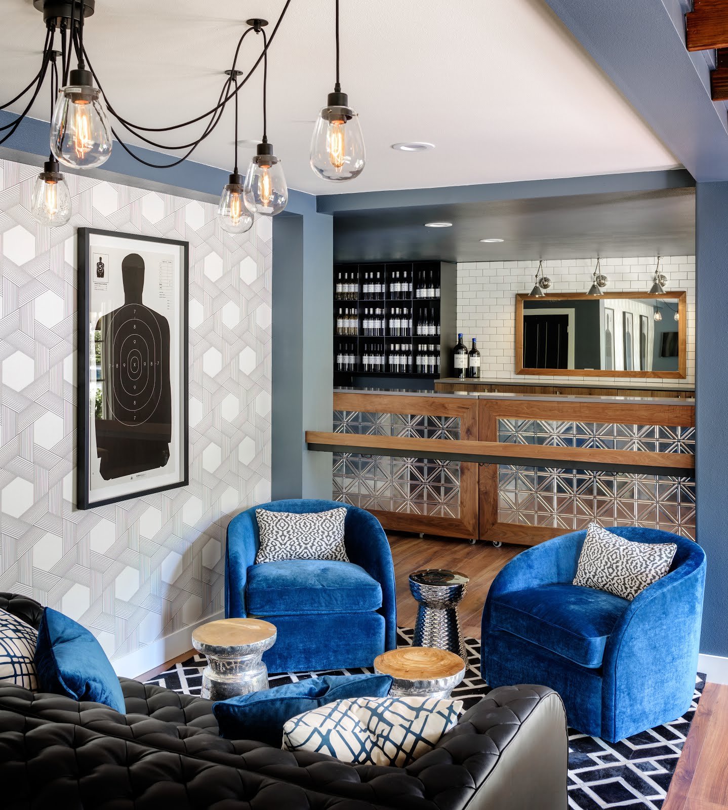
Beth Dotolo: This is impossible to answer, but if I had to give one I would say conceptually, the color purple because it defines creativity, although we rarely use purples in our designs.

Carolina Gentry: It is impossible to have one! Our design style is represented by an array of colors.

“ WE ARE NEVER NOT DREAMING UP DESIGNS TO WOW OUR CLIENTS”
— Beth Dotolo

SJ: Do You Use Color as a Dominant Role in your Designs or as Accents?

BD: I like to use one color as a neutral base and fill in with accents for our clients. Color does guide many of our designs, but more as an accent and not a scheme, which keeps spaces flexible and adaptable.

CG: I like using color as an accent in textiles for our clients. Color trends will come and go, so using it as an accent is a great way to be on trend without being married to any one style.

SJ: How Do You Feel about Matching Colors in a Room?

BD: I typically like our designs to form organically and find that color schemes feel too contrived.

CG: While it's not my personal style, it has it's place depending on the client and the project. If it's a nursery, match a way!

SJ: What Color Represents Your Personality?

BD: I would be a rainbow of jewel tones -- something vibrant, yet calm!

CG: I would say my personality is represented by tonal colors because they are the most my style which is a little unexpected because people say I'm very energetic.

SJ: What Color Comes to Mind When You Talk About:

Favorite City .....


BD: New York is red because it's so full of energy and never sleeps. The Big Apple!

CG: San Miguel De Allende. I think fuchsia is perfect to represent all of the beautiful Bougainvilleas that cascade on the buildings.

The House You Grew Up In .....

BD: The house I grew up in was brown, which feels like the perfect color to represent the old reliability of my soul.

CG: My parents are avid art collectors so the house I grew up in would be a color wheel. Maybe this is why I can never pick just one color!

“NO SPACE IS COMPLETE WITHOUT ART!”
— Carolina Gentry

The Last Fabulous Dinner You Had ......

BD: The last fabulous dinner I had was at the top of the Rowan hotel in Palm Springs with Carolina, Bobby Berk, and his wonderful partner Dewy, and Catherine Sheppard. I think of yellow because it's the color of friendship and happiness.

CG: We had an amazing dinner during Modernism Week with Beth and our friends Bobby Berk and Catherine Sheppard, which I’d give a caramel color to represent the moody dining space at the Rowan!

Your Favorite Flower ....

BD: Flora Green for a succulent!

CG: Rusty red for a protea -- I love that they’re structural and simple.

Your Favorite Season ....

BD: Olive Green for fall - the air is crisp and my birthday is coming!

CG: I think of white for spring because everything is brighter and I get excited about being able to wear white again

Your Favorite Piece of Art ....

BD: My favorite piece is the first original that I bought as an adult. It's this beautiful charcoal and oil painting, so I think of black and white.

CG: I can’t pick a single piece, but one that comes to mind is this abstract sketch and watercolor piece that I got at Alfies Antique Market in London. There’s a crazy backstory to this particular piece, but I think of cobalt blue like the watercolor.

Your Favorite Room in A Home ....

BD: The living room is my favorite room in a home because it's the place that family and loved ones come together to enjoy one another. I think of salmon because it represents joy and contentment.

CG: The kitchen is definitely my favorite room. I spend a lot of time cooking and it’s truly the heart of the home. I think of white because you just can’t beat fresh white walls!

Your Favorite Beauty Product ....

BD: I think of blue to represent any hydrating or overnight mask. You have to replenish with all the travel we do for Pulp!

CG: Blush for the La Lotion Essence de Rose by Dior… it’s amazing!

Your Favorite Article of Clothing ...

BD: My favorite piece in my closet right now is a pair of black Gucci loafers. Black is classic and can elevate any outfit and feels like the prefect color for investing in staple pieces, just as we do for clients!

CG: Army green for any kind of lightweight jacket!

SJ: Name a Color You Never Use?

BD: Never say never , but we rarely use yellow.

CG: There isn’t any color that I would never use, but people tend to have a hard time with chartreuse. However, every color has its place when used in the right way!


SJ: Name a Color You Use Frequently?

BD: We've been using touches of royal blue a lot recently!

CG: Navy!

SJ: If You Could Pick a Name for a Color What Would It Be?

BD: Kismet - the name seems to be showing up in our lives and new collections a ton lately.

CG: Cielo Blue, which means sky in Spanish!

SJ: Do You Have a Pet? What Color Reminds you of Him/Her? Do you Have a Nickname for this Pet?

BD: We have a cat named Boris who is very full of personality. His name really says it all. I think of jade green because of his eyes.

CG: A Frenchie named Ripsie! I think of black and white because that’s what she is!

SJ: What is the now Neutral?

BD: Camel

CG: A moody blue or tan!

SJ: What is Your Prediction of the Next Big Color Trends?

BD: Lapis Blue has been huge color trend that is here to stay for awhile.

CG: A broad spectrum of blues, from moody to pale!

SJ: What are the Best Color Combinations?

BD: I have been so into cobalt blue, black and tan and anything fuschia grounded by a good neutral.

CG: Any combination of neutrals always look amazing together. I also love burnt orange and indigo, and olive and blush.

SJ: Best Advice When It Comes to Picking Colors?

BD: We do a lot of neutral paints accented with statement wallcoverings for our clients. Go with a rich neutral to ground your space as trends change. They're the easiest to work around, but sometimes the hardest to select because all of the nuances in shades.

CG: We always pick paint colors for our clients in the actual space we will be using it. Lighting changes everything so it’s essential you see the color under the room’s natural light to get an idea of what it will look like.

 
“DESIGN IS ABOUT EXPERIENCE”
— Pulp Design Studios
 

Hue Are You? with Mary Douglas Drysdale

Hue Are You?
Designer Spotlight: Mary Douglas Drysdale

We are honored to have as our first guest Washington DC interior designer Mary Douglas Drysdale. One of America's top interior designers with more than 60 magazine covers, Mary's classic style bridges traditional with modern. Known for her architectural interiors, it is her bold use of color that makes her the perfect choice for our series plus she's a fabulous friend!

Photo: Ron Blunt

Susan Jamieson: What One Color Represents Your Design Style?

Mary Douglas Drysdale; Yellow, but not because it is my favorite color, it isn't. I think yellow represents my design style because it is to me a color of optimism and warmth, it is bold and works around the clock and from season to season. It is based in history, and one of Thomas Jefferson's favorite colors, being a Charlottesville girl, the Jefferson connection makes it in my mind perfectly classical.

Photo: Gordon Beall

I OFTEN EXPERIMENT ON MY OWN HOUSE BEFORE USING AN IDEA OR COLOR IN A CLIENT’S HOME.
— - MARY DOUGLAS DRYSDALE

Photo: Gordon Beall

SJ: Do You Use Color as a Dominant Role in Your Designs or as an Accent?

MDM: I think that I would have to say that I use it as an accent. I start my projects always by planning the spaces and developing the elevations. It is the architecture that always comes first for me. I really work hard on creating the balance and emphasis points via the architecture and I have always felt that it was a careful eye to the architectural aspects of a room that made the use of most any color easy. I think that the architecture supports the personality of any color.

Photo: Jeff McNamara

SJ: How Do You Feel about Matching Colors in a Room?

MDM: I never use a lot of different colors in a room. I like to use different values of two or three hues in the same room and bring in accents via highly decorative elements and most often via the use of bold and colorful art.

Photo: Peter Vitale

SJ: What Color Represents Your Personality?

MDM: I think that I would have to say deep grey because there is depth to the color, a certain elegance with a calming steady sort of effect. I guess I would also say reliable and just a bit reserved.

IN THE WAY I WORK, THE ARCHITECTURAL ELEMENTS OFTEN TAKE ON THE MOST IMPORTANT ROLE.
— MARY DOUGLAS DRYSDALE

Photo: Peter Vitale

SJ: What Color Comes to Mind When You Talk About.....

MDM:

Paris
......Hermes Orange

The House You Grew Up In..... Oxford Road house in Charlottesville. My childhood bedroom was pink.

Last Fabulous Dinner You Had ..... The spring green found in blue hydrangeas

Your Favorite Flower.....white roses

Your Favorite Season ...... Fall, the color of leaves that turn red in the hills of the Blue Ridge Mountains.

Your Favorite Piece of Art .... Art by Lyn Meyers, a deep cobalt blue

Photo: Ron Blunt

Your Favorite Beauty Product ... Channel nail polish/color du jour is 570 Androgyne

Your Favorite Article of Clothing .... A wonderful coat I own made by Oscar de la Renta. It is muted bronze toned leather on the outside with applied beaded detail and lambs wool on the inside.

SJ: Name a Color You Never Use?

MDM: Purple

SJ: Name a Color You Use Frequently?

MDM: Sherwin Williams custom mixed blue which is mid-toned and lively, while feeling classical and beautiful.

Photo: Francesco Lagnese

SJ: Do you have a pet?

MDM: Black and White. He is a Harlequin Great Dane and his name is Clifford.

SJ: What is the Now Color Trend in your Opinion?

MDM: I think rich brown is going to make a come back.

Photo: Alice Hoacklander

SJ: What are the best color combinations?

MDM: Black and white is such a classic and America's favorite. I also like black and tan, brown and black and green and blue.

Photo: Ron Blunt

I LIKE TO BRING IN THE UNEXPECTED.
— MARY DOUGLAS DRYSDALE

Photo: Ron Blunt

SJ: Best Advise When It Comes to Picking Paint Colors?

MDM: Don't follow trends, make sure that you sample every color you are going to consider selecting in big 3 foot by 3 foot swatches, and look at those colors, in the morning and in the evening carefully 24 hours after drying. Make sure that you look good in your room colors, and make sure that you look at a paint color with the textiles and surfaces that will be in the room.

Photo: Peter Vitale

SJ: Where Do You Draw Inspiration?

MDM: Walking in the city, books on architectural history, design, and travel.

SJ: Do you have a Signature Touch?

MDM: Finding an extraordinary table or desk in the classic style and placing a surprising modern art work above.