Hue Are You? with Kim Hoegger
Hue Are You?
Designer Spotlight: Kim Hoegger
Our next guest has it all: an interior design business - Kim Hoegger Home, a custom textile line - Kim Hoegger Textiles and a retail store Studio McKinney in Dallas, Texas. Her sophisticated cottage style can be seen both in her design work as well as her fabric and wallpaper line. I was thrilled to be able to view her work in person at the amazing Julian Price Showhouse in Greensboro NC sponsored by Southern Home Magazine. Kim stole the show with her breakfast room and traveler's room both rich in textiles, antiques and color. I can't wait to hear how she pulls it all together with color!
Susan Jamieson: What one color represents your design style?
Kim Hoegger: Definitely blue, as it seems to be the one color that I am constantly drawn to in many of my projects and my textile designs. I think that stems from my love of being near the water. There's nothing quite like the serenity of blue in the water and sky, hearing the waves crashing against the rocks and feeling the breeze coming off the water.
SJ: Do you use color as a dominant role in your designs or as an accent?
KH: I would say as a general rule, color plays a dominate role in my overall design concept of a space. I can't imagine a room without color even if it's just subtle color that brings the outside in. I think color infuses personality and energy. It's a necessary element to be considered in every room. I also consider white to be a color that can standalone as the dominant color within a space. In design, a white room is equally as pleasing as one full of color. I think it is important to be intentional about adding in the right textures and furniture pieces to create a layered and captivating environment.
SJ: How do you feel about matching colors in a room?
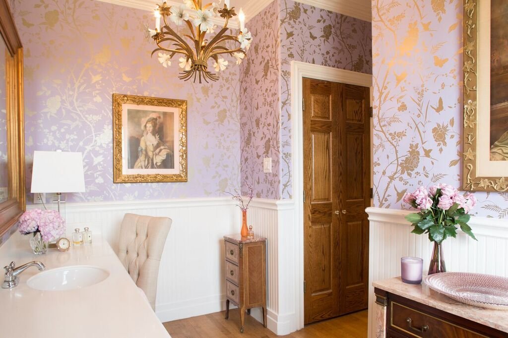
KH: I would say that most of my work reflects a love of colors that blend well together. I generally have a dominant color palette within a room and then use shades of the same color to blend patterns. I find that staying in the same color palette delivers serenity and calm. Both of which I find to be very important considerations for the way we live today – we need a refuge. I think that a simple, consistent color palette delivers that. A good example of this is the Traveler’s Room and Bath that I recently designed for the Hillside Designer Show House featuring the Julian Price House of Greensboro, NC. The rooms were especially small but the size was actually helpful in achieving the overall design concept for the space. I wanted the guest room and bath to provide the guest with a relaxing experience – to give them a place to unwind and recharge. I chose a simple palette of serene blues and browns to deliver the serenity that I was looking for. I selected a beautiful Thibaut wallcovering and coordinating fabric and applied the wallcovering to the walls and ceilings of both the bedroom and the bath – doing so encapsulated the room and created a breathtaking jewel box effect. The room hugs you and takes you away to a very quiet and personal place. French antiques added warmth and a well-traveled ambience to the room. I think it worked really well and a soothing, serene guest experience was achieved.
“LIVE PASSIONATELY, CREATIVELY AND BEAUTIFULLY”
SJ: What color represents your personality?
KH: Oh that’s a tough one – but I would have to say blue again. It’s just so many things to me – it makes me feel happy and it provides calm. Who doesn’t need happy and calm, lol.
SJ: What color comes to mind when you talk about:
Your favorite City .......
KH: Paris. And for some reason I always think of pink peonies, pink roses and pink macaroons.
The House You Grew Up In .........
KH: The house I grew up in, wow, that takes me back. I would say Orange and Pink. I remember my Mom being very “on trend” with color and fashion and our home always seemed to have the latest fashion in wallpaper. I specifically remember this very large scaled floral wallpaper in the main bathroom with orange, yellow and pink mod looking flowers. I loved that paper! And maybe more impressive was the pink tile that she paired it with! Fab job Mom!
Last Fabulous Dinner You Had ........
KH: So many wonderful dinners to recall but the one that comes to mind first is a very special dinner with friends on my first night in Venice. The color would have to be green. We dined in a magical place just off the main palazzo with so many people buzzing outside – the walls were handpainted in beautiful shades of green with glorious floral motifs strewn about that seemed to dance with the music that played outside. It was a magical evening.
Your favorite Flower .......
KH: Roses in every color.
Your favorite season .......
KH: Ahhh, Summer. Blue.
Your Favorite Art ......
KH: My favorite art pieces are always vintage oils so they are usually darker with warm browns. Muted shades of all colors.
Your Favorite Room in Your Home .....
KH: The Kitchen. A good kitchen always has some crisp, clean white.
Your Favorite Beauty product ....
KH: Dior Makeup - Classic Black.
Your Favorite Article of Clothing ......
KH: Blue jeans and tennies because they go together like peanut butter and jelly. Blue and white.
SJ: Name a color you never use?
KH: Red
SJ: Name a color you use frequently?
KH: Aside from blue, I love white. And I love it because it’s fresh and crisp and provides a beautiful gallery like backdrop for so many projects. I love to do lake and coastal projects where we paint the walls a crisp white and the water seems to reflect off the walls. It’s beautiful.
SJ: If you could pick a name for a color what would it be?
KH: I think I would like to name a color after one of my favorite foods – Truffle Fries. LOL. Doesn’t that sound like a pretty color? Sounds delicious!
SJ: Do you have a pet? What color reminds you of him/her? Do you have a nickname for this pet?
KH: Yes, we have two dogs in our family. We love our dogs. Boss is a beautiful yellow lab and he’s the happiest and most loving guy. When I think of Boss, I think happy and yellow is such a happy color. Nick is our King Charles Cavalier. He is supposed to be regal and refined but honestly, he grew up chasing squirrels with Boss and he thinks he’s a lab! So, he isn’t so regal anymore as he would rather be chasing squirrels than sitting at your feet. But when I think of Nick, I do still think of a more regal color like black as he is still very regal and refined when he sits at your feet after a long day of chasing squirrels.
SJ: What is the Now Neutral?
KH: I think we are seeing all shades of blue as neutrals today, particularly navy. I see it used like black and grays have been in recent years. You see it popping up on kitchen cabinets, furniture pieces, rugs and even art. It’s a great neutral but it’s also a great accent color too!
SJ: What is your prediction for the next big color trend?
KH: While at High Point Market this past week, I noticed a lot of blue – but most often I noticed a very pale blue being shown in lamps, rugs, and wallpapers. I even noticed the same pale blue in the antiques that I ran across in the Antique and Design District. I also noticed it being paired with beautiful antique brass and foiled gold. Very special.
“WHAT I LOVE MOST ABOUT INTERIOR DESIGN IS CREATING BEAUTIFUL SPACES THAT BRING JOY TO THOSE THAT LIVE IN THEM. I LOVE CREATING HOMES”
SJ: What are the best color combinations?
KH: The best color combinations are those where the colors were meant to be used together. I am all for an eclectic room and throwing in unexpected things but even an eclectic room has to have balance and continuity. Use a color wheel from any local art supply store – it’s like what you learned in grade school art class – certain colors work well with other colors. And some colors really don’t work well together at all! It’s elementary.
SJ: Best advice when it comes to picking paint colors?
KH: My best advise about choosing paint colors would be to do some research on undertones and be aware of what colors actually make up the color that you are considering. Does your paint have a black base or a green base? Does the white have a blue or pink undertone? Undertones make all of the difference in the world. Educate yourself on what makes a great color so that you don’t paint an entire room with a white that has a green undertone when you needed one with a blue undertone. Nothing ruins a room quite like the wrong paint color.
