Bridget Beari's Design Chat: What is Wabi Sabi?
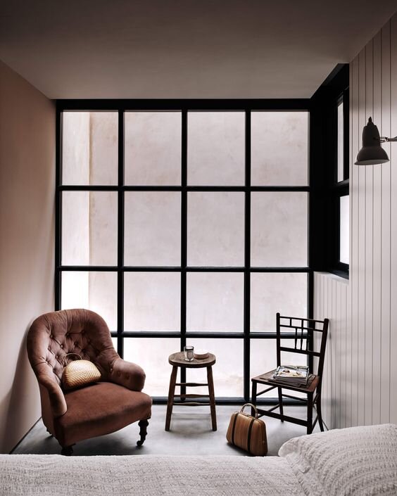
Wabi-Sabi (侘 寂) is a world view popular in Japanese culture that centers on the acceptance of imperfection. It was introduced in the 15th century by Buddhist monks whose cracked vessels were repaired with gold thus embracing and celebrating the flaw. The aesthetic is described as beauty that is "imperfect, impermanent, and incomplete". Wabi means peace, harmony, simplicity, and balance. Sabi is the natural flow of time or authenticity of aging. When we apply this concept to design, we are creating interiors that are designed with mindfulness, both using old and new objects.
photograph: Michael Sinclair Design: Chan & Eayrs
I call Wabi Sabi style, “Living The Mix” at Bridget Beari. Always using a touch of old with the new. Antiques, handcrafted objects, and wood tones. I tell people never to throw anything away until we have viewed it and searched for its purpose. It is our client’s home and using objects of meaning is important to them and always takes the design to another level. Whether that is an antique bed or a small vase, its the personality of room and tells a story.
roseandgrey.co
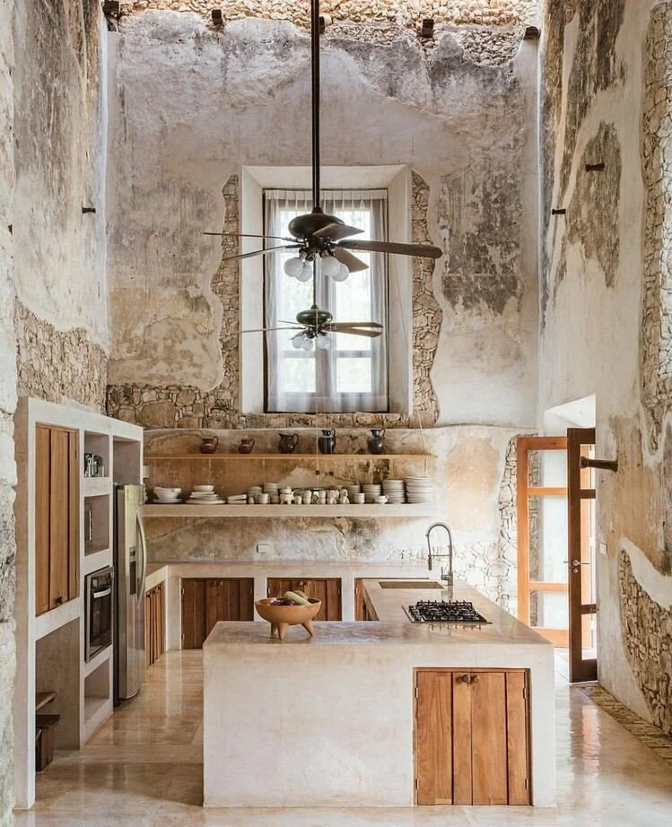
A Wabi-Sabi home embraces simplicity through its weathered and worn style. An old plaster wall with pealing paint is highlighted for its beauty not stripped to perfection. This gives the room a sense of peace and tranquility. This style allows you no stress. Don’t worry about that making things perfect. Just live! Stacked books on the floor, cracked teapots for display, pealing paint…. Remember there is beauty in imperfection.
photograph: Michael Sinclair Design: Chad & Eayrs
You may not want to go to extremes with this concepts but following some simple guidelines can help give your interiors that peace and harmony one needs to love your space.
Bringing Wabi-Sabi into your interiors helps infuse life, warmth and makes your interiors feel more real to you as well as others. Have you ever walked in a room and it just feels good? Let’s find out how that works by following these simple steps.
Bridget Beari Designs: Tulum Photograph: Joe Bernado
Use Natural Materials like wood, metals and stones. Embrace the warmth nature of organic textures as we did here in our Alys Beach project. The sink is placed upon a naturally weathered log with metal bowl and faucet. Such beauty in it’s simplicity.
Bridget Beari Designs: Alys Beach Photograph: Joe Bernado
2. Keep It Simple. Clear the Clutter. This is the easiest to do. Start with the goal of mindfulness. If it has purpose it stays. If it has meaning it stays. Only use what you need and what gives you joy.
Vilmupa.com
3. Embrace Imperfections. A cracked vase, a worn leather ottoman, a torn fabric: they all tell a story. In a world of Instagram perfection, just say it’s Ok as is and I love it! Mixing an antique chair in within modern upholstery gives room life and makes it feel real. How many room do you see that look cold and staged? Repurposing is another great way to achieve this goal. Using an old cutting board as art, an old ladder to hang towels or mix matched collection of pottery are prefect examples.
closettocurtains.com
4. Use Handcrafted Objects: local ceramic pots, handcrafted wood tables, hand made spoosn or cutting boards , there are so many ways to add these elements to a room and we have all sorts of local artisan pieces at the store or check us out online.
Photograph: Michael Sinclair Design: Chad & Eayrs
5. Bring the Outdoors In. Plants or anything natural like sticks work wonders to create warmth in an interior. If you kill every green plant, we have some wonderful faux greenry at the store. Trailing vines look amazing on a bookcase or coffee table. Small succulents can also give such life to a bathroom counter top and no watering is required.
Bridget Beari Home Store
If you are like me then decorating brings happiness and adding a little Wabi-Sabi just takes our client’s interiors to another level. It may be subtle in some cases but our design style is all about purpose and beauty! Try it yourself and let me how you did.


