The Treehouse Project

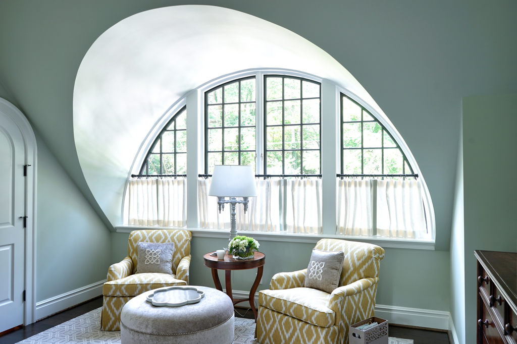
Our treehouse project in Richmond is truly an amazing before and after. Architect Pat McClane did an superb job of recreating a simple Cape Cod house by opening up the floor plan and adding some key architectural elements like the arched windows. 

You can see some more photos of this house in this month's Rhome Magazine but here are some photos of other rooms that were not shot for the magazine. 

The client likes to call this her treehouse because when the back doors are open you feel like you are in the trees. We took this idea and added color, art and items that echoed this  in a subtle way.

We love the beautiful sliding back doors painted black. 


Our Bridget Beari Colors paint Pia No. 31 really shines in this amazing master bedroom. Those windows, although a challenge to cover for privacy, are a real showstopper! 

Collected and colorful was our goal! 

Our subtle nod to our client's love for the University of Richmond spiders! 

Thanks for stopping by to check out our work! We are super busy this fall with the DC Design House, Southern Living showhouse, Southern Style Now Traditional Home Showhouse in Savannah, and of course the opening of our new store: Bridget Beari Home. 

Buckhead, Atlanta Homes & Lifestyles’ 2017 Southeastern Designer Showhouse

“Our room was created with subtle hints of all the activities a young man and his dog would enjoy in springtime,” says Susan Jamieson. “We loved experimenting with the geometrics and mixing of the patterns, as seen in the headboard...”

Jamieson designed a custom headboard, which was handmade from slabs of reclaimed wood in a bold, geometric pattern painted in calm yet cheerful colors from her Bridget Beari Colors paint collection.


Southeastern Atlanta Designer Showhouse

Bridget Beari Designs was trilled to have participated in last month's Atlanta Showhouse sponsored by Atlanta Home and Lifestyles Magazine. We have been working in Atlanta our the past few years so this seemed like a perfect fit.  We were given the little boy's room and chose to create a space that paid homage to handcrafted items as well as a nod to the historic nature of the home.

You can see some Scandinavian influences in the design through the use of texture and materials. I wanted to create a room showcasing our Bridget Beari Colors paint but do something more creative than paint a wall so I designed this wood headboard in 5 of our Bridget Beari Colors - Rambo, Maddy Tingy, Caesar, Beebop, and Snowball. It became the anchor for our design.

From the headboard came handcrafted items from Tate Pray, a Charlottesville craftsman who made the bed and the Poof Chair in Walnut. A beautiful and simple design that coordinated so well with the antique chest and leather chair. 

Touches of texture in the Kat Kozy quilted throw in raw Murino wool, the Moroccan wool black rug with super long tassel edges, wool draperies, and linen sheeting.

Handcrafted clipboards with map art were a perfect choice for changing art in a kids room. Our selection of Baltimore artist Theresa Bauer kept a simple image with white void space and natural framing. 

Following the geometric shapes of the headboard came the off centered light fixture - again with space voids. You can also see from this angle the wool draperies are made of 3 different patterns sewn together to create a trapezoid shape when the two panels are closed together. 

The theme of the room was "A Boy and his Dog in Springtime" everything a boy might do or enjoying doing - walking his dog, canoeing, archery, hiking in the woods, and enjoying a comfortable and cozy room when he returned home.

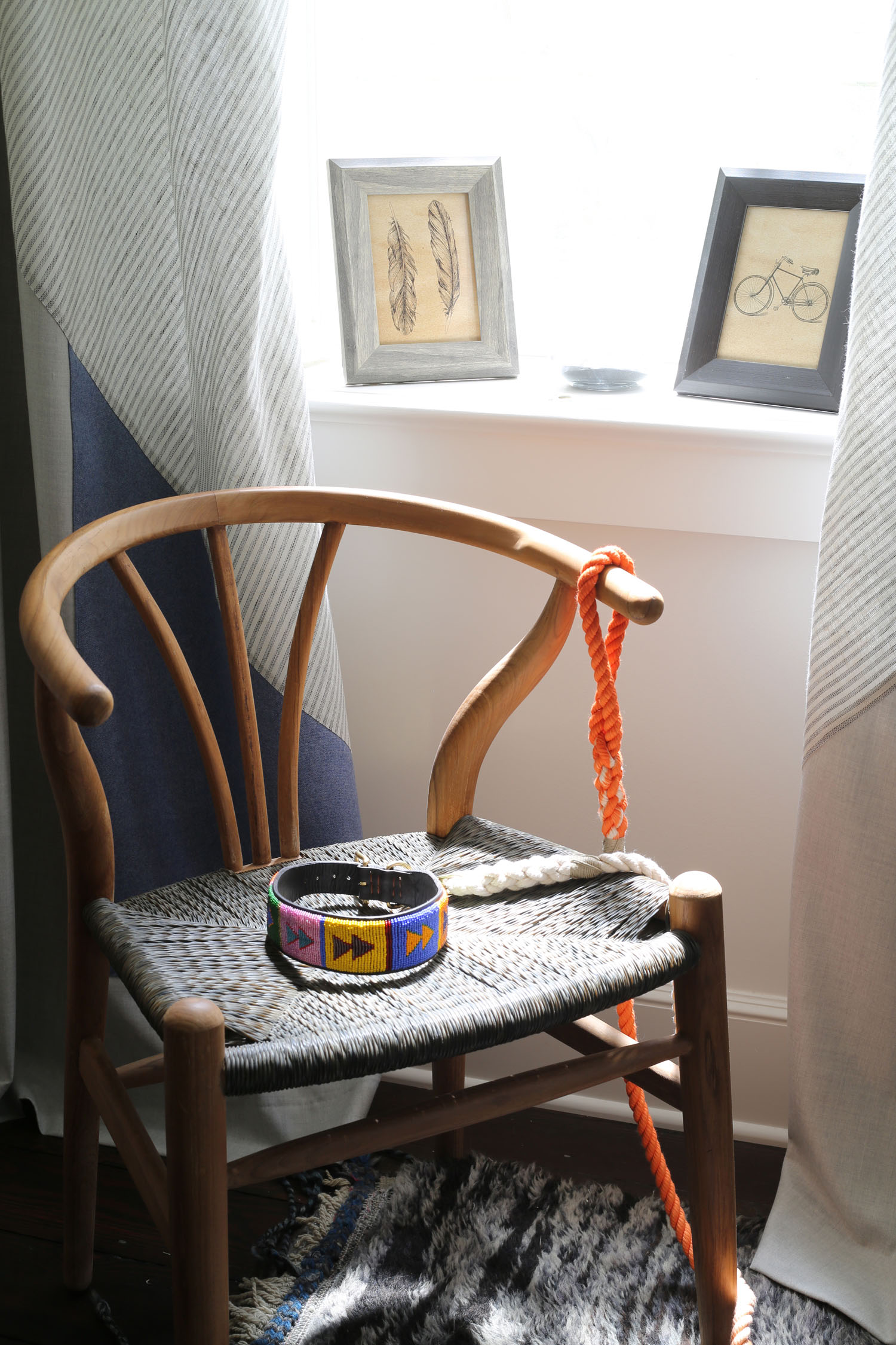
Our African dog collar and dog trophies continued our theme. 

Accents of brass to hint at the historic nature of the home and give warmth to the room. 

Black and White Dog Portraits by Amanda Jones, a renown photographer from Boston. 

I find a designer hour is the perfect place to experiment with ideas. Mixing shapes and patterns was a big part of this rooms dynamic.

Only measuring about 10' X 16' the room packs a punch but is also relaxing and cozy. 

The Pierre Frey sham was the perfect combination of shapes and colors to accent the bed and the round ball Designer Guild wool a perfect distraction from all the angles. 

Black iron frames of feathers seem to float on the white walls. 

Adding the pop of yellowrod leather gives the room energy as well as nod to antiques. A home that has collected items and history. 

A little whimsy in the bathroom filled with hand painted bulls eyes to continue our theme. 

Thank you to all our vendors, craftsmen and women, carpenters, movers, and fans! We had a great time in Atlanta meeting new and old friends!

The wood headboard was designed using 5 of our Bridget Beari Colors
- Rambo, Maddy Tingy, Caesar, Beebop, and Snowball -

Anatomy of a Room: Parisian Style

In this series I take rooms I love and break them down into key points that make the room work visually, artistically and architecturally. This room is a Parisian apartment designed by interior designer Jean Louis Denoit. He is known for his classic style with a contemporary twist but what I love the most about JLD style is his fearless mixing of patterns and antiques.

This is why is this living room works so well:

photo - ELLE DECOR

1. Tones of Blues
He starts this palette with blue tones, light to dark, robins egg to federal blue to black. Repeating the colors with just the right balance in the walls, carpet and ceiling. The stronger accents of black are in the etageres and sculpture bases to anchor the room. He adds gold to warm up the room but soft enough to continue his feminine palette. Just an odd touch of green to mix it up. Nothing is too perfect. He is also not afraid to mix the metals, silver mirror over the mantel with gold etageres, chandelier and sconces.

2. Scale
I love his use of over scaled ceiling patterns to match the rug pattern. All the architectural details were added to the room as the apartment was completely gutted. The large molding on the ceiling against the perfectly scaled picture molding on the walls and dental molding. A beautiful contrast. His furniture pieces move throughout the room from high - etageres and sculpture to mid range - lamps and art to low - seating. The seating seems to be all in the same plane. Curves of the sofas balanced against the curves of the chairs. Not to mention how this all relates to the ceiling and carpet curves - brilliant!

photo - ELLE DECOR

3. Antiques with Modern Pieces
Although many of this pieces are high end, antiques or custom I was surprised to find some Arteriors, Osborne and Little, and Vaughan modern pieces added in. Things that we all can purchase but mixed in they look as expensive as the antiques. Original art and sculpture along side marble carved mantels and mid century lamps. It is a real art to be able to combine elements so beautifully.

4. Balancing Act
The room is symmetrical with 2 lamps, 2 sofas, 2 tables but it does not feel stagnant. By using the 3 pieces of pottery on the back console your eye looks at the green pot then the strong blue small pillow that pulls your eye from the glass sculpture on the wall. The shapes repeat from the circular moldings on the wall to the sculpture over the console and the rectangular picture molding repeats on the sofa flat braid. Different scales but thoughtfully placed. I also love the white accents of trim on the sofa, crystals on the chandelier and moldings. It gives the room a beautiful ice palace effect.

photo - ELLE DECOR

This is one of my favorite rooms of all time. I love studying the pieces- accessories, color, and scale.

Thank you for reading Anatomy of a Room! Leave me a comment and let me know what you think of Jean Louis Denoit's Parisian apartment.

Bridget Beari's National Ad for DXV

Have you seen the latest DXV national ad Campaign launched in all the major magazines? I was fortunate to be chosen among the 4 designers across the country to help DXV, American Standard's luxury plumbing line, design a bathroom in one of their selected themes.

 All room photos by Earl Kendall studios

The theme was Design movements inspired by certain eras and cities. My theme was 1890-1920 Charleston, South Carolina.

Everyone asks how the design process works with DXV and what is really amazing is that we, the designer's, really designed these bathrooms and kitchens as we envisioned them. No corporate PR direction just pure design from real designers. That is what makes this experience and the DXV group so incredible! 


How it starts: 

Veronika Miller, of Modenus is the brainchild behind the concept of designing real spaces with real designers. Here she is as she explains the process and introduces this year's cities: 

Since my theme was the early 1900's, I did research on the progressive era after the Victorian clutter but before modernism. Having visited Charleston many times I love the historic homes, the architecture, and the symmetry in the designs. Taking something noticeably antique and classic and making it modern was my goal.

Here is a video of all the designs: 

My design highlights reflecting Charleston include: 

symmetry
spiderweb window
crown moulding pulled from Drayton Hall
Greek Key motif
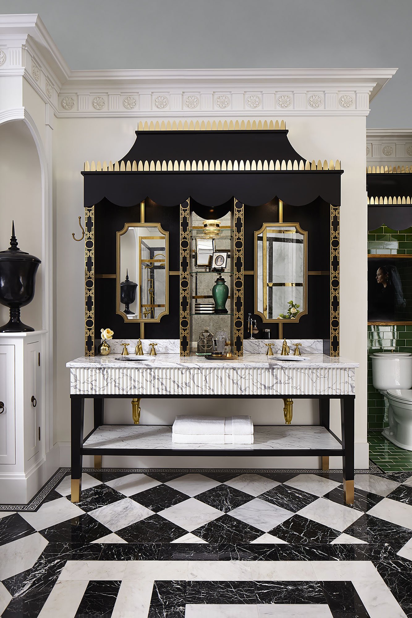
Black and white marble floor
Brass Fretwork
English grisaille mural
hutch metal top from an English kitchen 

The spiderweb window was a focal point as this classic Georgian motif immediately reminds me of Southern style. An attempt to recreate the cultured and dignified styles of Europe but with a new world twist. 

I was very focused on keeping the symmetry that is why the inverted niches at the corners were so important to the design. If you look on the floor plan, Those curves mimic what happens in the shower wall. 

The large scale crown moulding runs throughout the space giving it a sense of grandeur and classic luxury. 

Everything was built on set directly from these drawings with only 1 on site meeting with the art director and 1 day of shopping locally for accessories. The Sheraton chair, brass hinges, guerdion table, green vases, shaving brush and antique frames were all bought at local antique stores in Minneapolis, an amazing city! 

Thank you to Decorators Supply for the crown moulding

There were phone calls during the building process but by the time we arrived on set the bathroom was built. The team did an amazing job getting all the details just right. Although they said my plans were so detailed there weren't many questions! 

My job on-site the final day was to help with the finishing touches and styling to get it just right!

I wanted the bathroom to be a look back to a classic era but also a look forward to a bathroom that could be used today. I live in an older home so designing something that looks classic but feels modern was the intent.

 Key modern elements: 

  • curved glass shower wall

  • oversizing the Greek Key motif

  •  gloss emerald green tile highlighted with the black linear Greek key tile- current trend color

  • geometric marble pattern in the shower

  • modern Flemish photo with bubble wrap in her hair as a veil. 

  •  addition of the brass - current trend

  • black undermount sinks

Thank you to Schumacher for the fabric on the antique chair

Thank you to Heritage Tile for their gloss green tile
Thank you to Earl Kendall studios for the Flemish girl photo

I found that this is really where DXV products shined for me. The selection was spot on for the design. Classic Oakhill toilet, cross handle Randall faucet in the beautiful aged brass finish, the classic Fitzgerald tub, Tub filler again the perfect shape and finish, the shepard hook shower arm and cross handle levers in the shower and sinks. I mixed it up with adding the Pop black undercount sinks for a modern touch.

Thank you to Mural Source for the wallpaper

The vanity was my pride and joy as I designed the entire piece and it was constructed just perfectly. The fluted carerra marble front, the fretwork from Decorator's SupplyBridget Beari Colors metallics paint MT Bastille Brass, metal hood with brass tips, custom mirrors, antique mirror backs in the center shelves. It was a beauty!

I am so proud of this design as it is the perfect marriage of old and new. It celebrates the classic era in a 21st century way.

Thank you to everyone that made this ad possible - Veronika Miller, Modenus team , DXV team, Earl Kendall studios, Jim Goulet ( and team ), videographers, photographers, stylists and more! It was a team effort and a dream come to life.

Look for the ad in all the national shelter magazines, Veranda, Southern Living, House Beautiful, Architectural Digest and more! 

Give us a shout out on our Instagram or Twitter @bridgetbeari if you see it in print! 

Check out all the other amazing designs from this year's DXV Designer panel

 Keep Making Things Beautiful …….