Hue Are You? with Cheryl Kees Clendenon

Hue Are You?

Designer Spotlight: Cheryl Kees Clendenon

Owner and lead designer and saucy critic of the status quo, Cheryl Kees Clendenon has been an influential presence in the design industry for over 18 years. Her sharp wit, bold opinions, innovative designs and attention to detail has earned her national recognition and more design awards than any firm on the Gulf Coast. Cheryl and her firm have been published in over 60 consumer magazines and books. Cheryl approaches each project from big to small with the same detail-oriented and fresh, unpredictable design aesthetic that has garnered her national attention. Clients, ranging from San Diego to the New Jersey shore and all along the Gulf Coast, respect her confident and innovative solutions to the most challenging of design parameters as well as her outspoken irreverence.

In her spare time she also authors an influential design blog chronicling the daily drama of a working designer along with info on products she loves, designs she hates and a “tell it like it is” look at being a small business owner all while dispensing valuable design and project management knowledge that she has accumulated over her many years in the industry. Cheryl is wife to Randy and mom to Mackenzie and Libby. She resides on beautiful Pensacola Beach, Florida with her husband and impossibly adorable Aussie shepherds, Luna & Sailor Mae. 
I love it when a designer loves color.  Here we go with Cheryl's view on color: 

Susan Jamieson:  What one color represents your design style? 

Cheryl Kees Clendenon: This is hard! I cannot claim one color but a type of color- saturated. If had to pick one I think ( this month) it would be a deep mulberry raisin laced with a bit of blush to make it unexpected.

SJ: Do you use color as a dominant role in your designs or as an accent?

CKC: Absolutely and we are known for it. Our shop is a riot of color amongst many shops in town that are white, beige and gray. But not a wild crazy riot of color- much more sophisticated.

SJ: How do you feel about matching colors in a room?

CKC: What does match mean? :) We do not match hardly ever unless going for a monochromatic color story. We thrive on mixing unusual hues together and making it work. In fact, this is my favorite part of my work.

SJ: What color represents your personality?

CKC: Depends on the day, the hour, the minute. I am a chameleon- high strung, crazy creative type that sleeps very little. But if had to choose one color it would be a deep green but I wear mostly black.

SJ: What color comes to mind when you talk about:

Your favorite City ....... Seagreen- Pensacola’s coast is this color on a clear day

The House You Grew Up In ......... Beige- apartment blah

Last Fabulous Dinner You Had ........ Green- i love some veggies

Your favorite Flower ....... Ahhh a tropical bouquet of coral reds for sure

Your favorite season ...... we don't have seasons on the coast but for sure my fave is summer- and that color would be golden like sand in the sunlight

Your Favorite Art ...... That is easy- a mid century wood cut by now deceased artist Carol Summers- big blocks of color- deep aubergine, coral red, bright blue and some darker shades- but the aubergine is what I associate it with.

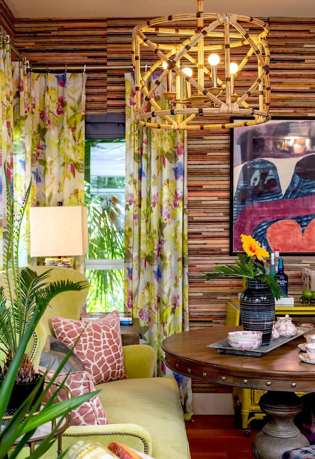
Your Favorite Room in Your Home ..... The “undining room” where the Summers art lives- along with a citron velvet sofa and floral water color drapes and phenomenal sari bak bak wall covering. this color cue would be blush even though it is only in a pillow.

Your Favorite Beauty product ....Black for mascara

Your Favorite Article of Clothing ...... Distressed charcoal and gray- my old cowboy boots

SJ: Name a color you never use?

CKC: I will use just about all of them in the right setting but am not a “smokers yellow” fan- you know the color white gets in a smokers home- ugh. A cross between fleshly yellow and smokers yellow.
SJ: Name a color you use frequently?

CKC: Purple shades, persimmon

SJ: If you could pick a name for a color what would it be?

CKC: Smokers yellow- only because everyone knows what that would be and yuck.

SJ: Do you have a pet? What color reminds you of him/her? Do you have a nickname for this pet?

CKC: Sailor Mae- our shop dog. She is a tricolor aussie and love the brown on her nose!

SJ: What is the Now Neutral?

CKC: Deep aubergine for us or a raisin brown with slight red undertones- Painted a guest house this and is fab with deep green trim

SJ: What is your prediction for the next big color trend?

CKC: More saturated colors in unexpected combinations because I want it to be so. No more match-y match-y unless uber traditional which we are not.

SJ: What are the best color combinations?

CKC: Well this depends on the texture of what you are choosing! But always the unexpected ones. vintage wine with a light teal, french gray, and a deep blue.

SJ: Best advice when it comes to picking paint colors? 
CKC: I call these My Paint Color 411: 

  1. always look at paint it in different locations in the room

  2. Do not be afraid to buy samples- big investment- get the samples

  3. never allow the colors you are considering to be next to each other

  4. do not color match ever- it is not the same- use the brand.

  5. The easy way to see undertones is have a pure white piece of paper and look at it next to that- short and sweet but with a trained eye it works

  6.  get a good education in art history- this is my background and it has been the biggest contributor to the way I see things in layers

  7. do not use fleshy beige or smokers yellow- ever

  8. Buy the good paint- it is worth it

  9. paint your ceilings almost always

  10. it is a myth that your house will look good in the same colors you like to wear- not the same in any way!

Hue Are You? with Jeffrey Johnson

Hue Are You?

Designer Spotlight: Jeffrey Johnson

Born and raised in Mississippi, Jeffrey grew up loving fashion but transfered that love to interior design in 2008. He focuses mostly on contemporary interior design projects from Nashville to Dallas to LA. His design style encompasses the design of interior spaces for impeccable lifestyles. He is intrigued with how people are living and thrives on using textiles, furnishings and lighting to collaborate on a distinctive hues and complementing styles. 

He is one of this year's Style Spotters for the International Highpoint Furniture market where he selects and reports on the latest trends in the furniture industry. Jeffrey is full of style both personally and in his interior spaces. Let's take a glimpse into his world of color.....

Susan Jamieson:  What one color represents your design style? 
Jeffrey Johnson:  Blue is very evident as it resonates many of the cool colors I tend to apply in the design style.  The color reflects water and sky and that itself automatically a naturally soothing color.  Also, the color gives many of us the calm and quiet effect that we need in our lives in the today's world.  Soft blues can help you relax and switch off after a long day.

SJ: Do you use color as a dominant role in your designs or as an accent?

JJ: The Gray color offers the stability of blending with colors and textures very well. I love using the challenge of gray by finding the finding the right shade of grey as a warm gray with a brown/red/yellow undertone, a cool gray with a green, blue or purple undertone and a neutral gray with the middle of the path grays with no undertones.

J: How do you feel about matching colors in a room?

JJ: To apply the monotone layer of one color in many variations of shade and texture will show off the stunning space quite well and yet it is never overkilling using the fact of using one color in the monotone setting. You don't get to see this very often; however, this is an opportunity to show your design skill set and make a compelling statement in a very undermining aesthetic environment.

SJ: What color represents your personality?

JJ: Blue to the tea. I am a water person, and it reminds me of the benefits of blue applies to the mind and body. The blue character matches my personality to the symbolization of trust, loyalty, wisdom, and faith.

SJ: What color comes to mind when you talk about:

Your favorite City ....... Amsterdam - I think of the color Blue and the Delftware resembles the color, culture, and history

The House You Grew Up In ......... 70’s Traditional Spanish Style Home on the lake. Yellow countertops and brown panel wall were the main colors Last

Fabulous Dinner You Had ........ Ravioli Rosa - Homemade ravioli filled with ricotta cheese and spinach in a pink and green at Tra Di Noi Restaurant in Malibu

Your favorite Flower ....... Hydrangea Pink, the soft and rich color.

Your favorite season ...... Fall is my favorite season, I love the colors ranging from orange, yellow, and burnt red. It is like no other seasons. Even the Fall brisk cool air brings memories of the Fall colors

Your Favorite Art ...... Anything related to water and movement by Christopher Martin - https://www.christophermartingallery.com/ I love all the ocean blue shades

Your Favorite Room in Your Home ..... The monotone of all blues in the Living Room

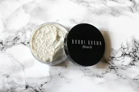
Your Favorite Beauty product .... Beach Body Scrub by Bobbi Brown - Sand Color make me smile and how it feel good to your feet.

Your Favorite Article of Clothing ...... I think of Nantucket when I buy the color, Lobster reef, from Vineyard Vines.

SJ: Name a color you never use?

JJ: Green

SJ: Name a color you use frequently?

JJ: Grey

SJ: If you could pick a name for a color what would it be?

JJ: Dutchie Blue

SJ: Do you have a pet? What color reminds you of him/her? Do you have a nickname for this pet?

JJ: Yes, two chocolate labs. The brown colors remind so much of the 70's and how much the color dominates our everyday lifestyle to this day. I love brown when it comes to wall paint color. I did that in my home office in Dallas. It was a very light gray and it was tough to be motivated and work, so I changed it to a dark brown color wall. Best decision I ever made.

SJ: What is the Now Neutral?

JJ: White

SJ: What is your prediction for the next big color trend?

JJ: I am not sure why I would say this, but pink in many variations of soft tone shade would be a thriving factor of classic and elegant setting.

SJ: What are the best color combinations?

JJ: Green, Gray, Cream

SJ: Best advise when it comes to picking paint colors?

JJ: Pick three shades of one color, slap the three shades of one color on the wall, and check the colors in the morning, afternoon, and evening. It is the least expensive way of testing colors before making the final selection shade of color.

Bridget Beari Color Rule #9 - Take Clues from Your Closet

Bridget Beari Color Rule:

Take your Color Cues from Your Closet

Sometimes the easiest way to find your personal style is to look at the clothes you wear. This will tell you what colors appeal to you and how accessorized or simple your tastes are.

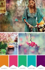
For example, the picture below shows a girl in a Bohemian blousey shirt with multiple bracelets and necklaces. She also drives an orange VW Beetle.

Below is a room that might appeal to her. Bright colors, patterns and bold shapes. It could also be very eclectic from places she has traveled. It is her look and her style.

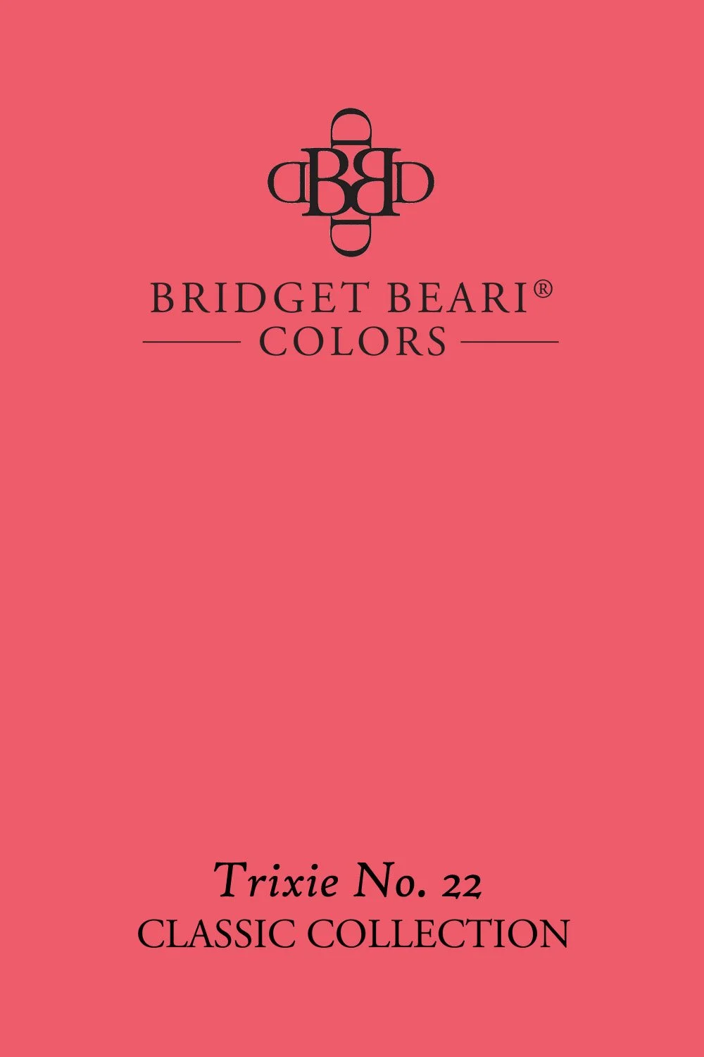
Good Bridget Beari Colors for this look would be: Trixie No. 22 and Bing Bong No. 28

My own personal closet is more classic. I have mostly gray, white, black and some khaki. I feel more comfortable in these colors and around these colors therefore my house has similar colors. I love neutral but interesting textures.

This foyer would represent the classic fashion color schemes.

If you watch It's a Brad Brad World. You will notice that Brad Goreski- loves himself some plaid, color, and a bow tie. He is a mix of old and new but still classic and clean.

His look might translate into a room like this:

A classic look with pops of color behind the bookcase and traditional leather with modern detailing.

Try Bridget Beari Colors: Bababooey No.25 and Rambo No 44

Sidebar: Trixie was a horse from my childhood horseback riding camp. We did a cowboy and indian play on horseback. I was an Indian and rode Trixie bareback in full costume as we chased the cowboys. I was about 10.

Bing Bong is the nickname of my cat Bing. We call her Bing Bong because she is so silly.

Bababooey is the nickname Joe the BBD contractor gave my Sharpei Lulabelle. He is a big Howard Stern fan and Bababooey is one of the characters on the show.

Rambo is the name of my neighbors wired hair dachsund. He rides on a Harley, dresses for Halloween, and is very vocal. We call him " the Man." Big like Rambo!!

Tip: Tone is how Intense, Bright or Dull a color is.

Hue Are You? with Libby Langdon

Hue Are You?

Designer Spotlight: Libby Langdon

Libby Langdon is an interior designer, author, product designer and makeover television personality, as well as the creative force behind New York City-based design firm, Libby Interiors, Inc.  She is fast becoming known for her growing collections of branded home furnishings for Crystorama Lighting, outdoor furniture for North Cape and indoor/ outdoor rugs for KAS rugs. 

Libby’s interior designs and home products have been featured in leading shelter magazines: Architectural Digest, Traditional Home, House Beautiful, Better Homes and Gardens, Hampton’s Cottages and Gardens and is a contributing editor to House Beautiful magazine. Langdon has been a regular makeover design expert on NBC’s TODAY Show, HGTV’s Small Space - Big Style, The View, The Rachael Ray Show, FOX’s Design Invasion and NBC’s Open House.

 She’s written a book, Libby Langdon’s Small Space Solutions, and travels across the country presenting informative seminars to consumers, designers, and retailers about all things design. How does color play a part in her cool elegant style? Let's find out....

Susan Jamieson:  What one color represents your design style? 

Libby Langdon:  Blue, it represents my Easy, Elegant, Everyday Style. 

SJ: Do you use color as a dominant role in your designs or as an accent?

LL: I would say usually color is used as an accent in most of my projects, but that come from what will be timeless and so often they are worried they will tire of a color if it's a dominant part of the design. That being said I'm working on a wonderful project in Vero Beach where color will be front and center in each and every room, I love when a client wants to go there!

SJ: How do you feel about matching colors in a room?

LL: I don't really feel like colors need to "match" but rather play well together. In every design I usually start with what I call a "connector" fabric, it's a multi-color print or pattern that weaves several of the colors l'll use in the space together, that becomes the springboard for the room’s palette. This helps the client see we have a roadmap and something that's guiding the design. I also know if they like the color combo in the fabric, they will love the way I work with those colors on different items, and ultimately adore the room design.

SJ: What color represents your personality?

LL: I think it might be yellow, I'm a pretty perky, positive person and I'm always smiling and usually happy, sort of like human smiley face. I was once referred to as a cross between a self- help interior designer and a bubbly life coach, I like that!

SJ: What color comes to mind when you talk about: 
Your favorite City ....... Sag Harbor - blue because it's surrounded by water and the sky goes on forever.

The House You Grew Up In ......... Brown- it was a gorgeous old English Tudor house with wonderful chocolate exterior woodwork and amazing stained mahogany paneled walls throughout the interior of the house.

Last Fabulous Dinner You Had ........ Pink- I made the yummiest fresh grilled shrimp from the fresh fish stand near our house and the color of the shrimp didn't look real, it was so fresh.


Your favorite Flower ....... Hydrangeas - the cornflower blue color makes me swoon...my Mom calls that color "Libby Blue" because she knows how much I love it.

Your favorite season ...... Fall - orange, it's my husband’s and mines favorite time of the year, it's when we got married, we love the cooler temps and the romantic feel in the air. I love that back-to-school mentality, I always think it's the new year for me rather than January.

Your Favorite Art ...... Lime green- it may not be my favorite piece of art but it's the most recent one I've bought and it's a wonderful abstract hanging over the fireplace in our master bedroom. It's got all sorts of bright colors like hot pink, bright blue and I don't normally use lime green but I'm loving it as an accent in our room right now.

Your Favorite Room in Your Home ..... Tan- family room - this is where the life really happens in a house and people get to rest, relax, play games, watch movies, spend easy time together...I design so many family rooms with tan as a base neutral and I'm ok with that. Rather than thinking its uninspired I like to think of it as creating a room when people can gather and feel like they are getting a big fat hug, kind of like putting on your favorite broken in pair of khakis

Your Favorite Beauty product .... White - Creme De La Mer is hands down my go to skincare product, I feel like I'm doing my skin a favor when I use it!

Your Favorite Article of Clothing ...... Cobalt blue - 2 years ago for Christmas my husband gave me this awesome fleece zip up Cubs sweatshirt, it was the year they won the World Series and I became a total Cubs baseball fan. It's at our house in Sag Harbor and that's where I get to wind down and relax and even if I'm working when I'm out there, that fleece is so comforting...I take deeper breaths when I wear it, now that's a fave article of clothing!

SJ: Name a color you never use?

LL: Rust and olive green...had to name two!

SJ: Name a color you use frequently?

LL: Blue

SJ: If you could pick a name for a color what would it be?

LL: Magic Hour

SJ: Do you have a pet? What color reminds you of him/her? Do you have a nickname for this pet?

LL: No, still working on trying to keep our house plants alive!

SJ: What is the Now Neutral?

LL: Navy Blue

SJ: What is your prediction for the next big color trend?

LL: Turquoise

SJ: What are the best color combinations?

LL: Red/Gold/Black - Navy/Green/White- Spa/Tan/cream- Teal/Gray/ Navy

SJ: Best advice when it comes to picking paint colors?

LL: - Choose colors with more gray undertones than you think, it may look dull on a paint chip but a super clear, bright color on a paint chip can read like a kids playroom fun house when you actually get it up on the wall. Also, don't paint a million test patches on your wall, you will never know what it looks like from that, if you're working with an interior designer trust them, they know what it looks like because they've probably used it a million times and can send you a picture of it in a room. Otherwise look at your paint color and Google if you can see what it looks like in a space or see if the paint company has a virtual tool where you can see it in a room.