Bridget Beari Color Rule #74 Limit Colors but Not the Range
Bridget Beari Color Rule Number 74
Limit Colors but Not the Range
It is not so easy to create a single hue room or a room filled with only analogous colors. The key to the combination is to create a range.
Below the room is mostly greys and grey blues. The designer has limited the color palette but stretched the range of grey into blue and violet. It create a beautiful flow and softness.
Interior by Ken Fulk
This room is mostly taupe but the lighter and darker variations blend and create contrast. The darker draperies against the even darker floor. The flat tape on the linen walls. All of these color are from the same hue but again the range is varied.
Interior by Luis Bustamante
The easiest way to do this is to create a mood board. Kelly Wearstler is the queen of combinations. Here is a tray she created full of objects that have similar hues. Some colors are stronger and other softer to create that perfect balance. It is easy to see how this is done in nature - see the agate and the marble cut in the tray.
Kelly Wearstler
If you are working with warmer colors this is a great example of a limited palette but the range is strong and dynamic. Bursting color over tones of gold.
Another way to test colors is to experiment with watercolors.Testing and mixing combinations let's you experiment with range while understanding the undertones.
Brigit O'Connor
So go ahead and test the rule - limit the color palette but not the range!
Happy Painting ...
Tip:
You've asked for the DIY tips to come back so here they are.
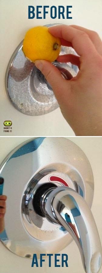
Cleaning water stained bath fixtures with lemon. An easy and nice smelling way to remove hard water stains.
Bridget Beari Color Rule #68 Contrast is the Key to Expansion
Contrast is the Key to Expansion
People always ask me "If I paint that room a dark color then the room will look smaller" or vice versa "Light colors will make it look bigger - right? " While in general these statements may be true it is really the creation of contrasts or lack of that diminishes or expands a room size.
Let's look at examples of this:
This foyer has a dark charcoal wall and ceiling with charcoal carpet as a runner on the stairs. While the dark color adds to the drama it is the white contrast trim that stops your eye and makes the room seem more intimate.
In this dining room it is the artwork that stops your eye on the navy wall which makes the dark color come closer to you.
On the opposite side less contrast in colors whether dark or light create spaces that recede.
Here the room is different shades of the same blue green color. This allows your eye to travel around the room creating volume and room seems larger even though it is painted a darker color. Painting the ceiling a lighter shade of the walls is another trick to heightening the ceiling.
Again in this room the use of low contrast makes the colors recede creating a larger room. Low contrast doesn't have to mean white or neutral. Here the room is paint a soft green - trim, doors, cabinetry and walls.
So remember " Contrast" when discussing expansion or diminishing a room size!
Happy Painting …
Bridget Beari Color Rule #56
How to Use a Bold Green
As Pantone announced the color of the year as Emerald green, Bridget Beari was already busy introducing our Exotic paint color line - 49 bright and brilliant colors. I find that using a bright color is very much a technique because you need to know how much is too much or garish. Green is a great color to do as a bold.
Here are our new bold greens - named after dogs of course! I mixed these so they would give just the right amount of punch without being too electric. Green is a cool color and as most cool colors do, it has a calming effect. You might say these bright colors are not calming but I feel it is all in the way they are used.
The adjectives that characterize green include money, growth, fertility, freshness, and natural. Other adjectives include envy, jealousy and quilt.
I love looking at things around me for inspiration in my color choices.
My everyday Green drink!
My love of succulents! Did you see my Echeveria at the Showhouse? I love the softness of these greens.
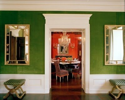
The best way to use these bright greens is to balance it with a contrasting color. Here they used a navy to set it off and cool it down.
Quadrille Fabrics
In Tory Burch's home they kept it clean with the high gloss white trim. Such a pretty shade. Similar to my Waikiki E27
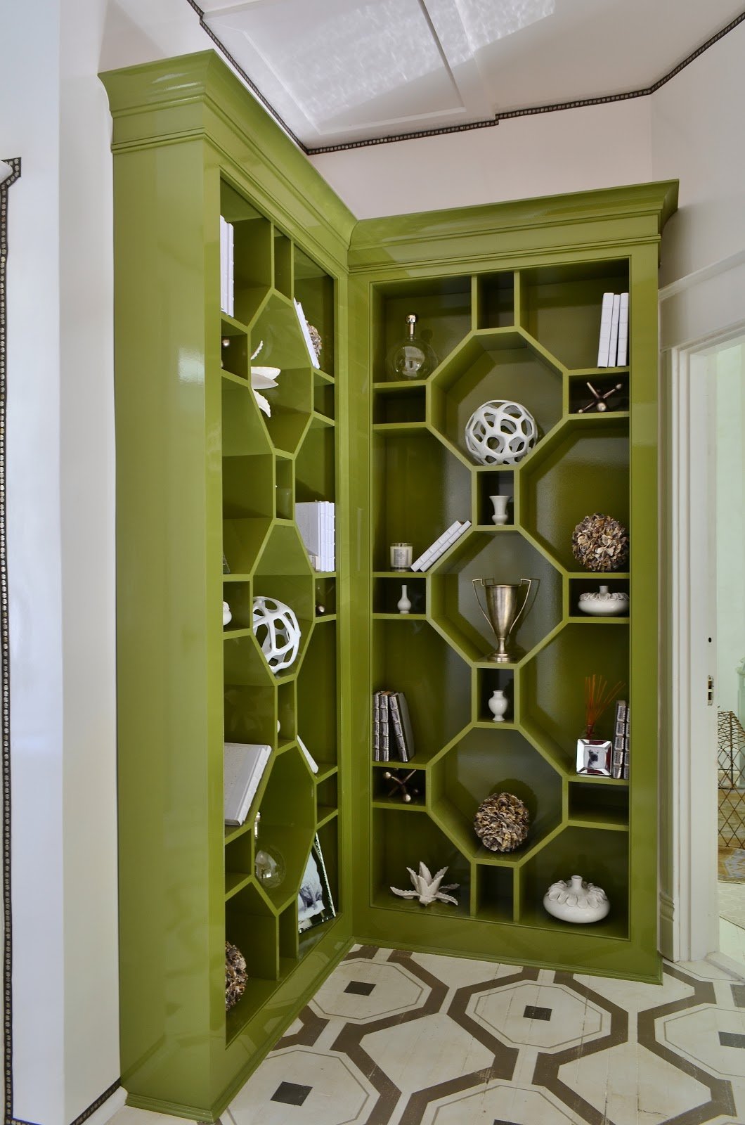
The Bridget Beari showhouse octagon bookcase in high gloss also shows this crisp contrast with white. This is Pickle No. 37 from the Classic Collection.
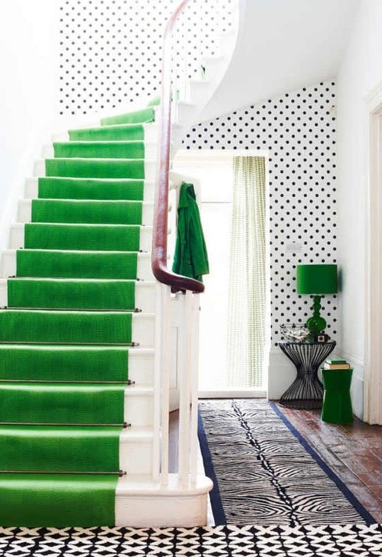
Such a beautiful and dramatic contrast here as carpet in a black and white room. This is similar is Dizzie E25. Almost like that 70's Papagallo green!
So remember to venture into the exotic and order your Bridget Beari Paint deck at Bridget Beari Colors.
TIP
I thought this was a great idea for some smells in the powder room without a candle. Put a few drops of essential oil on the cardboard roll. The scent will fill the room.
HAPPY PAINTING
Bridget Beari Color Rule #46 - Bring on the Bling!
Bridget Beari Color Rule #46
Bring on the Bling!
I love working with metallics in a room. Whether on a wall or a piece of furniture, metallics give the room a reflective quality and bounces the light from one area to the next.
We are excited to announce that coming this summer will be our Bridget Beari Metallic line of paints - silvers, golds, coppers, pearl essence and more!
Look at how these designers used metallics to enhance their designs. I love the minimal design of this bathroom.
The metallic walls create a modern and clean look. Too much metallic in a room can be overkill unless you keep it minimal.
Photo from Completelt Totally Madly
Painted furniture from Wisteria
Metallics with a glaze for furniture from Froufrugal
Mixing metallics can add even more highlights to a room.
Here they have mixed a gold and a silver!
Photo by Remodelista
If you want to add a touch of bling, try a stencil.
Photo from Apartment Therapy
How about a gorgeous textured wall in metallic!
Photo by Amy Murray
Tip: Take old mixed matched tins and spray paint them. See the Cynthia Shaffer blog for complete directions. How about using a metallic!!
Happy Painting.....
Bridget Beari Color Rule #45 - Faux Sure
Bridget Beari Color Rule #45 - Faux Sure
Sometimes a room needs more than just straight paint. I think faux painting is not something everyone can do. Either you have that artistic touch or you don't. You want the faux finish to look subtle and elegant not bold and garish.
Interior Design by Bridget Beari Designs
I love the copper ceiling of this dining room and how it picks up on the color of the draperies. The walls have a soft glaze to them as well as a painted scroll. This subtle pattern is a great contrast the bold drapery fabric. Plain cream walls would be too uninteresting and solid color too predictable. Even the corner cabinet in this room is faux bois or faux wood grain.
Photo via Pinterest
Using a textured wall gives the room a softer glow and even a Old World look. You can add more than one color to a ragged wall. This technique can look as soft as velvet on the walls if done well. It could also look contemporary with metallic added to it.
Tip: Use left over wallpaper to line your drawers!
Happy Painting.....


