Bridget Beari Color Rule #56
How to Use a Bold Green
As Pantone announced the color of the year as Emerald green, Bridget Beari was already busy introducing our Exotic paint color line - 49 bright and brilliant colors. I find that using a bright color is very much a technique because you need to know how much is too much or garish. Green is a great color to do as a bold.
Here are our new bold greens - named after dogs of course! I mixed these so they would give just the right amount of punch without being too electric. Green is a cool color and as most cool colors do, it has a calming effect. You might say these bright colors are not calming but I feel it is all in the way they are used.
The adjectives that characterize green include money, growth, fertility, freshness, and natural. Other adjectives include envy, jealousy and quilt.
I love looking at things around me for inspiration in my color choices.
My everyday Green drink!
My love of succulents! Did you see my Echeveria at the Showhouse? I love the softness of these greens.
The best way to use these bright greens is to balance it with a contrasting color. Here they used a navy to set it off and cool it down.
Quadrille Fabrics
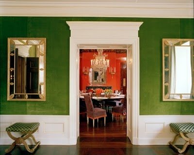
In Tory Burch's home they kept it clean with the high gloss white trim. Such a pretty shade. Similar to my Waikiki E27
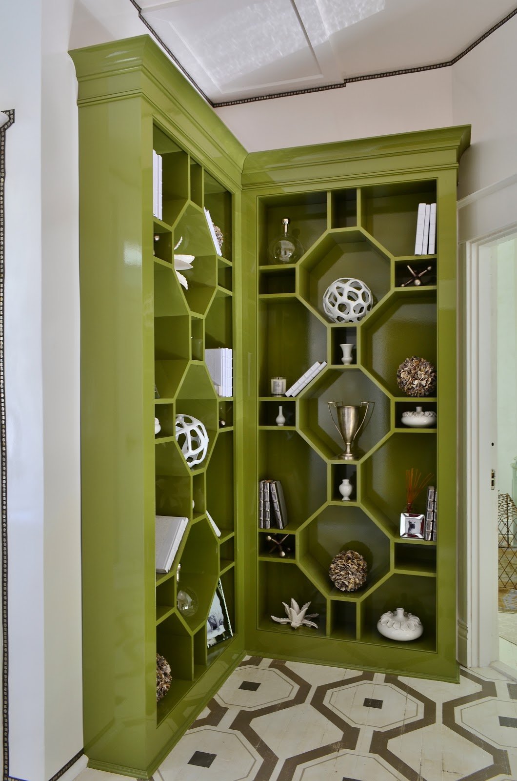
The Bridget Beari showhouse octagon bookcase in high gloss also shows this crisp contrast with white. This is Pickle No. 37 from the Classic Collection.
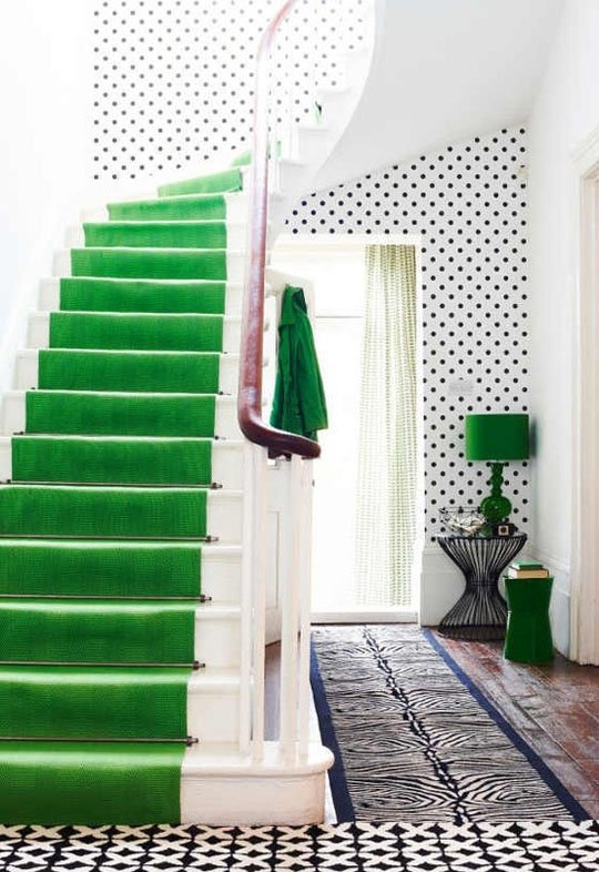
Such a beautiful and dramatic contrast here as carpet in a black and white room. This is similar is Dizzie E25. Almost like that 70's Papagallo green!
So remember to venture into the exotic and order your Bridget Beari Paint deck at Bridget Beari Colors.
TIP
I thought this was a great idea for some smells in the powder room without a candle. Put a few drops of essential oil on the cardboard roll. The scent will fill the room.
HAPPY PAINTING
