Featured in Luxe
Our Naples project was featured in the Naples/Sarasota issue of Luxe
Our Naples project was featured in the Naples/Sarasota issue of Luxe
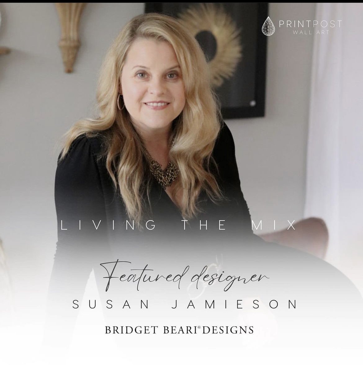
Introducing our first designer collaboration with Print Post wall art. This company is an interior designers dream with great selection on art, 2-3 week lead times and flexibility in size and framing. Their goal is “to create fun artwork for the interior design trade worldwide that is made sustainably with handmade quality craftsmanship in mind.” Check them out at: Print Post

Bridget Beari Designer Collection
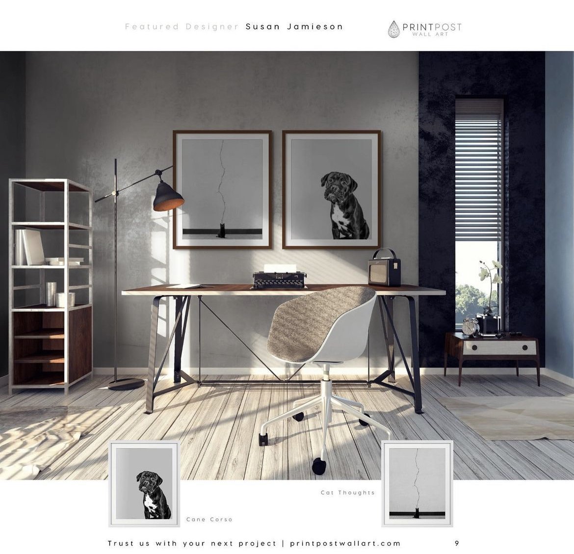
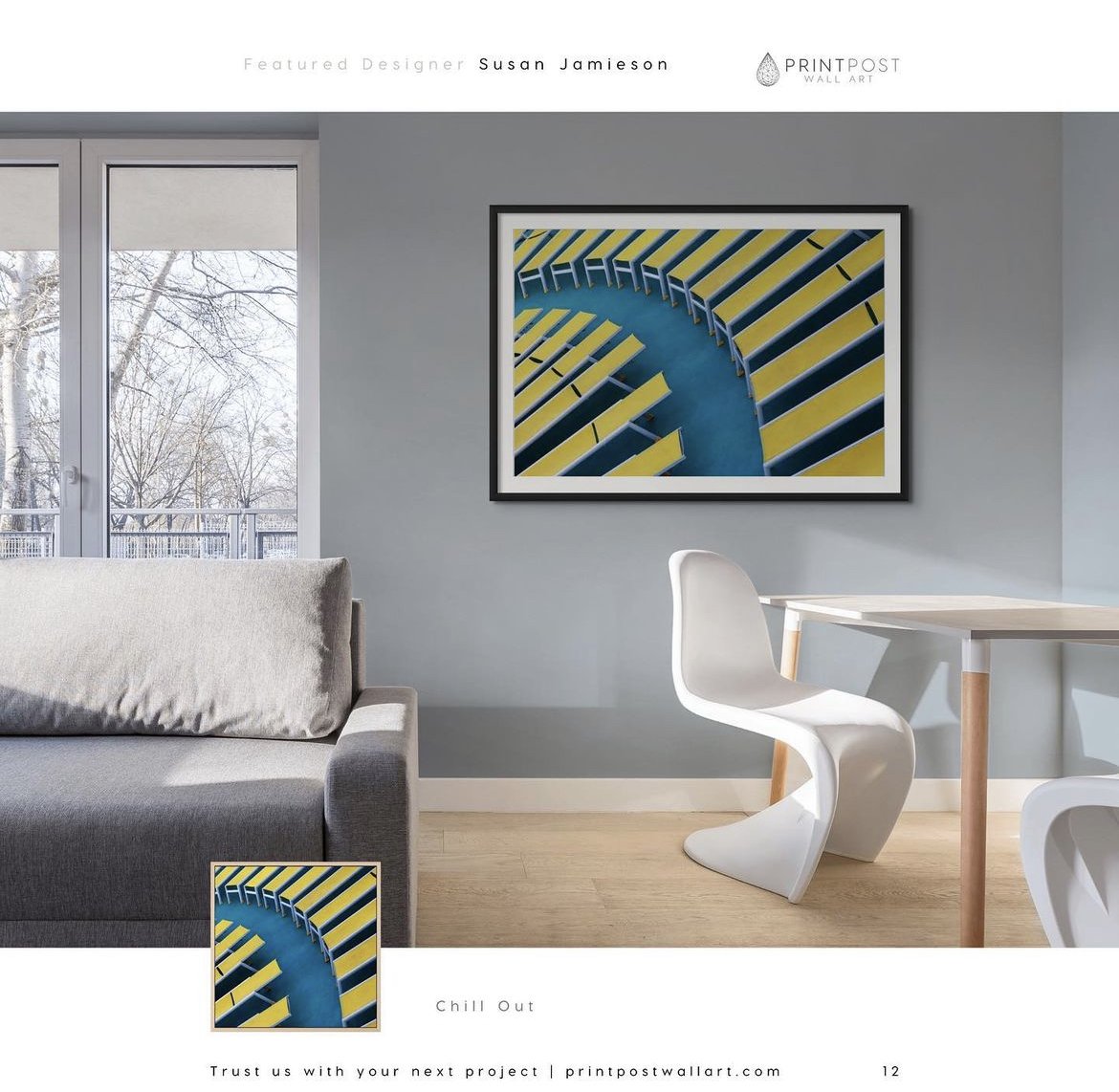
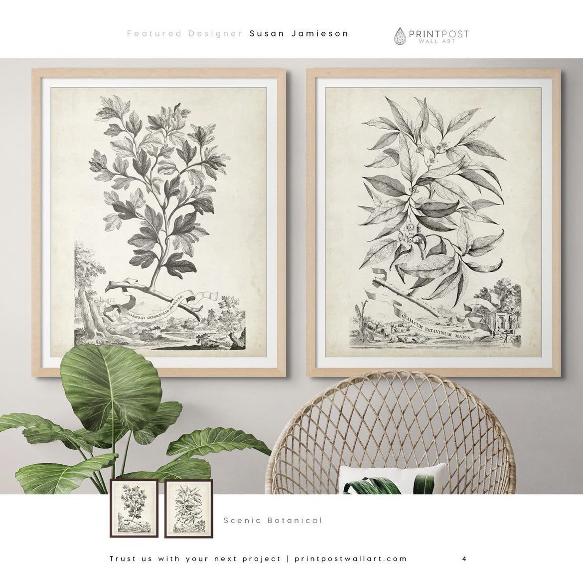
These curated pieces capture the motto of our firm, “Living the Mix” from botanicals to abstract images to our passion for rescue animals. Print Post really has everything I need for my diverse aesthetic.

Here are a few highlighted images:
Creating a designer centerpiece is as easy as 1-2-3! With just a bowl, branches and a bit of natural greenery, you can create a beautiful arrangement for your own home.
We used the Bridget Beari Home Store ceramic “Bumpy" Bowl. Its unique textured finish adds visual interest and balances the botanicals inside. But you can use any bowl that is approximately 14” wide x 7” high… deep enough to hold your floral design in place.
You can purchase branch bundles like we used online, or forage your yard for beautiful options! Tuck in gorgeous green accents like the Moss Balls and Eucalyptus available at Bridget Beari Home Store. Or change it up to befit the season and occasion with oranges, pumpkins, Christmas balls… use your imagination!
Our step-by-step tutorial shows you how to layer the elements. You can replicate our design or come up with your own masterpiece using these super easy techniques!
CLICK ON PRODUCTS BELOW TO PURCHASE FROM
BRIDGET BEARI HOME STORE
With its cool camouflage packaging and custom wooden striking matches, this is the perfect gender-neutral candle. The fragrance begins with an accent of a spice and opens up in oolong tea accord with notes of jasmine and vanilla. 100% soy wax with an 80-hour burn time.
Hand woven of natural materials, this bold basket is a comely catch-all for keys, wallet and other essential accoutrement. With its ebony zig-zag weave and artfully constructed attached top rim, nothing about this basket says ordinary.
Keep him cozy in this 100% wool blanket. Handwoven in Morocco on traditional wooden looms, the graphic black and white striped pattern is offset with chunky tassels. Black and white stripes are the new neutral and work well with any style and setting.
Practical and stylish, this chic, decorative plate is as unique as he is. Painted with an abstract agate pattern and finished with an antique gold edge. Perfect for collecting trinkets like keys, spare change and cell phone.
Sure, we can all look at our phones to check the time, but there is nothing as timeless and tasteful as a smart-looking table clock. Functional and handsome in polished nickel with industrial face plate and soundless battery operation. For his desk, bedside or shelf, he will think of you every time.
Composed of softly gray veined white marble and natural wood, this handsome tumbler is a versatile gift that can hold water, toothbrushes or pens. We like it in the bathroom with our white marble and wood tray (below) and lidded jar (here). If he has been good for goodness sake, you may want to gift him the complete set!
SOLD OUT
Help him stay organized with a classic, streamlined stone tray. Crafted of beautifully veined marble and a natural wood base, this attractive catch-all is fitting for the bathroom vanity, kitchen counter or dresser top.
SOLD OUT
Send your 007 a sign. Shaken or stirred, this whimsical sign says it all. No matter what kind of day he’s had or occasion he may be celebrating, the instructions are clear!
SOLD OUT
Coasters are always a useful gift, especially when they are this cool and versatile. Help him keep his coffee and bedside tables well-styled and ring free with this hard-wearing marble octagon set.
SOLD OUT
This striking and mesmerizing brushed steel eternity sculpture is a geometric wonder. Where does it start; where does it end? The perfect size for his desk, coffee table, book shelf… well, like the artwork itself, the possibilities seem to go on and on. And depending on the recipient, it could also be a symbol of eternal connection!
SOLD OUT
For his office or hip bachelor pad, this plump, geometric throw pillow is perfect for sophisticated styling as well as napping! Inspired by classic Moroccan carpets, the raised, nubby chevron design is super comfy with a masculine vibe that also melds with most décor. Finished in solid brown linen on back.
A playful pillow for a fun pop of texture and possibly a game of indoor basket dunking! Carefully constructed in solid black boucle that can withstand spills, stains and snoozing!
SOLD OUT
Bridget Beari Color Rule Number 74

Limit Colors but Not the Range
It is not so easy to create a single hue room or a room filled with only analogous colors. The key to the combination is to create a range.
Below the room is mostly greys and grey blues. The designer has limited the color palette but stretched the range of grey into blue and violet. It create a beautiful flow and softness.

Interior by Ken Fulk
This room is mostly taupe but the lighter and darker variations blend and create contrast. The darker draperies against the even darker floor. The flat tape on the linen walls. All of these color are from the same hue but again the range is varied.

Interior by Luis Bustamante
The easiest way to do this is to create a mood board. Kelly Wearstler is the queen of combinations. Here is a tray she created full of objects that have similar hues. Some colors are stronger and other softer to create that perfect balance. It is easy to see how this is done in nature - see the agate and the marble cut in the tray.

Kelly Wearstler
If you are working with warmer colors this is a great example of a limited palette but the range is strong and dynamic. Bursting color over tones of gold.

Another way to test colors is to experiment with watercolors.Testing and mixing combinations let's you experiment with range while understanding the undertones.

Brigit O'Connor
So go ahead and test the rule - limit the color palette but not the range!

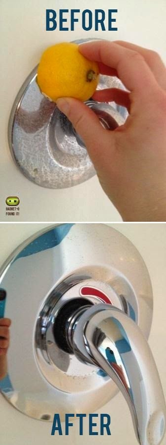
Tip:
You've asked for the DIY tips to come back so here they are.
Cleaning water stained bath fixtures with lemon. An easy and nice smelling way to remove hard water stains.