Hue Are You? with Justin Shaulis

Hue Are You?

Designer Spotlight: Justin Shaulis

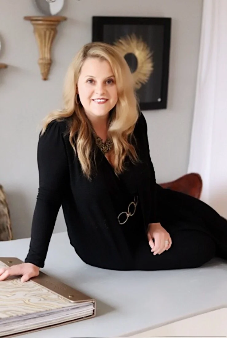
Our guest today is New York City interior designer, Justin Shaulis. Justin has over 15 years experience in both architecture and interior design. In 2002 he created his firm as a "studio environment utilizing holistic design methodologies based on context and quality of life in realizing Emotive design." Justin is best known for his work from New York to London as well as his hosting role on HGTV's "House Rules." He most recently was named the brand ambassador for Howard Elliott, a furniture and accessory company. Let's hear his views on color:

Susan Jamieson: What one color represents your design style?

Justin Shaulis: I consider myself a contextualist so I really work to draw from my clients the colors that excite them.

SJ: Do you use color as a dominant role in your designs or as an accent?

JS: I use color as an accent. I believe pending season, mood and/or place in life that colors affect you differently.

SJ: How do you feel about matching colors in a room?

JS: I believe any space should be well composed with the colors complimenting/ matching and coordinating.

SIMPLE LINES SCULPTED INTO INTRIGUING DESIGNS, ENHANCED BY EXQUISITE FINISHES ARE ALL THINGS THAT CATCH MY EYE.
— JUSTIN SHAULIS

SJ: What color represents your personality?

JS: Blue ... It's a complex tone that can be deep or surface rich. Blue can also border towards green or violet and a chameleon quality depending on the ambient lighting. Blue is also the color of my eyes.

SJ: What color comes to mind when you talk about:

Your favorite City ....... Granite.. New York City- my home with all of the stone, brick and pavement.

The House You Grew Up In ......... Green... The house I spent my formative years in was a one story brick home with wide overhangs set in a field dotted with trees with a centuries old maple tree and spring at its base anchoring the property.

Last Fabulous Dinner You Had ........ White.. The table linens at Printworks during the High Point Spring Market for all of the great conversations we had.

Your favorite Flower ....... Red-Orange... The Poppy. From bud to seed pod and the bloom in between, you don't know its hidden depths until the entire flowering cycle finishes.

Your favorite season ...... Emerald...Spring is my favorite season for all of the reasons of rebrith, new beginnings etc.

Your Favorite Art ...... Blue... From Australian artist Greg Wilson, I have a painting from his wave series, but this one is set at night with heavy impasto and the stars and moon glinting on the surfaces of a tremendous frothy wave.

Your Favorite Room in Your Home ..... Rich Brown.. The table - whether it is in the kitchen, dining room, or living room. It's home base for gatherings, talking, and sharing ideas.

Your Favorite Beauty product .... White... Dermalogica's Dyanmic Skin Recovery with SPF 50 is a great way to start the day.

I AM BLESSED TO MERGE TWO GREAT LOVES: MY TRAINING AS AN ARCHITECT AND MY PASSION FOR INTERIOR DESIGN.
— JUSTIN SHAULIS

Your Favorite Article of Clothing ...... Melon.. A perfectly comfortable cashmere sweater for all seasons.

SJ: Name a color you never use?

JS: I haven't met a color I did not like and I think each hue on the spectrum has its place.

SJ: Name a color you use frequently?

JS: Gray... I use gray as a neutral for a lot of my work as it can be cool, warm, modern and traditional.

SJ: If you could pick a name for a color what would it be?

JS: Mauve ... Blue and red mixed together creating a delicate grayish violet hue. I would rename "Mauve" as it conjures many negative connotations. Perhaps I could co-op "Blue Girl" to describe this hue from the hybrid tea rose.

SJ: Do you have a pet? What color reminds you of him/her? Do you have a nickname for this pet?

JS: I have two Shih Tzus - Norma and Neil AKA Normal and Neilson. Norma is white and cream and Neil is white and brindle.

SJ: What is the Now Neutral?

JS: Taupe ... I believe Gray is fading but Brown and Black seem too common leading the way for Taupe to have a resurgence as it sits on the fence of all three tones.

SJ: What is your prediction for the next big color trend?

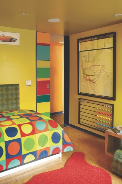
JS: Yellow ... It's the color of optimism and boots self-esteem and confidence.

SJ: What are the best color combinations?

JS: The best color combinations are the ones that support the client's lifestyle.

SJ: Best advice when it comes to picking paint colors?

JS: The key to picking the best paint colors for anyone is looking through your wardrobe and picking out those three pieces - one that makes you feel sexy, one that makes you feel comfy and one that makes you feel powerful. Whatever colors these are, they should be the first key to your color palette.

Hue Am I? with Me - Susan Jamieson

Hue Am I?

Designer Spotlight: ME - Susan Jamieson

With everyone's busy schedules after market I lost a guest for today so I thought I would just interview myself about color and design. I hope you like this truly one on one interview:

I, Susan Jamieson, am the owner and creator of Bridget Beari Designs, an interior design firm located in Richmond, Virginia. I have also created Bridget Beari Colors, a custom line of house paint colors. 200 custom colors of which 20 are metallic colors. I also founded and created Bridget Beari Papers, a custom wallpaper line that we sell online and through Bradley USA in Chicago, Atlanta, and New York, Supply Showroom in Austin Texas and Evans and Shelton in Washington DC. We just opened our own furniture store called Bridget Beari Home Store in January which sells our paints, wallpapers, furniture, art and accessories. For those of you not in the Virginia area, we have an online store as well through our website www.bridgetbeari.com.

Here are my views on color:

What one color represents your design style?

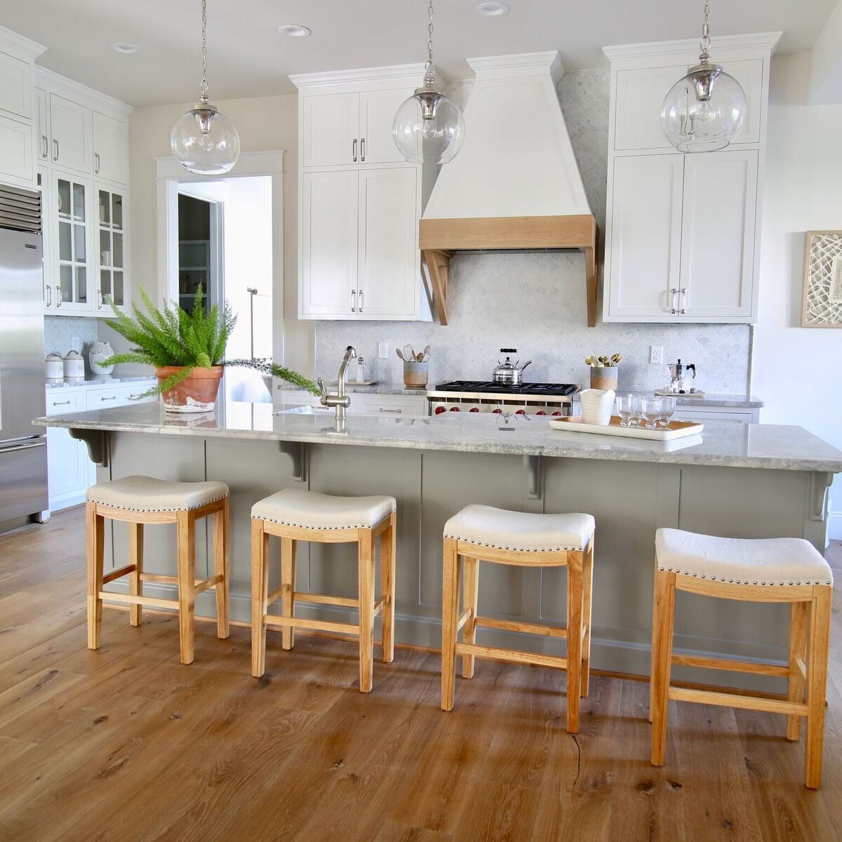
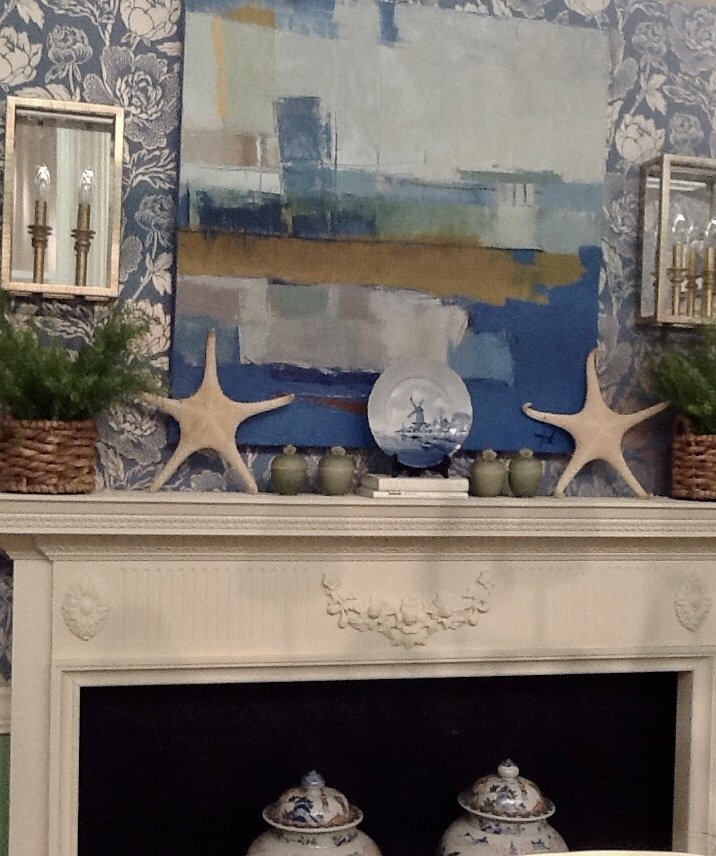
ME: White. I love using different shades of white in a room- walls, trim, cabinetry, ceilings. Subtle and bold, white has so many different looks while always remaining classic. Even when creating whites for my paint fan deck there were so many that I loved I could have created 100 shades of white. White is definitely a color for me. The walls in the photo below are actually venetian plaster so the sheen is amazingly beautiful as the light hits the walls throughout the day.

Do you use color as a dominant role in your designs or as an accent?

ME: I am more drawn to color as an accent within a room. Bolder colors in fabrics and furniture with splashes of accent colors on ceilings, backs of bookcases or cabinetry. Although I design rooms for clients that love bold colors, it is really more about the client's request or what fits their lifestyle and home.

How do you feel about matching colors in a room?

ME: I have a real aversion to the two color scheme. That basically means a room that only has two colors. Let's say green and khaki then all the items within the room are green or khaki - rugs, lamps, art, fabrics and so on... I am more drawn to a room that has mismatched colors or interesting color combinations. This brings the room to life. The two color room is way to elementary for me.

What color represents your personality?

ME: Black because I'm fairly a serious person. Definitely not grey or wishy washy. Focus and determined are my strengths. Green and White because I'm classically modern. My design style is all about "living the mix", taking what is old and repurposing or adding modern elements to a room. I'm green and white both inside and out as my garden is all green and white flowers.

What color comes to mind when you talk about:

Your favorite City ....... Tulum, Mexico. This house is the most magical place I've ever been and I was lucky enough to design it from top to bottom. Working in Mexico was challenge and well as an adventure. I love visiting this beautiful place and talk about colors - the Caribbean blue and greens of the jungle are inspirational to all my collections.

The House You Grew Up In ......... Light Blue. My mother allowed me to design my own room when I was 12. I had light blue/white shag rug and white/cream furniture, canopy bed and light blue walls. I loved it!

Last Fabulous Dinner You Had ........ La Farfalle in Charleston. The best modern Italian in the South. Nobu in Malibu for a birthday dinner - amazing chef's choice.

Your favorite Flower ....... Orchid. I love white orchids and the best part is we have a place in RVA called Chadwick Orchids you can send your orchids there once they stop blooming. They will board them and when they re-bloom they call you to pick them up. Brilliant - orchids all year long!

Your favorite season ...... Spring. I love to garden but I hate the pollen. I have the best kitchen garden for fresh herbs and simple veggies. My love knot garden, perennial garden, camelia garden and our courtyard full of potted plants and trees from small to large. Once everything is cleaned from the winter, we love to entertain outdoors!

Your Favorite Art ...... Bill Fisher. My husband and I started our Bill Fisher collection 20 years ago with a gift to each other for our wedding present - a 6 ft. painting. Since then we have collected over 15 paintings. As Bill has now passed away, they are more precious to us than ever. We will remember him fondly and cherish his talent.

Your Favorite Room in Your Home ..... Library. I love this room as it is the perfect place to sit in the morning with coffee for quiet time and the best place for wine in the evening for chatting about the day. Dogs on the ottoman and both of us in our chairs - we love this cozy room filled with books of the past and present, memories and treasures. Plus I love the caramel ceiling.

Your Favorite Beauty product .... The Ordinary Eye Serum - miracle in a bottle!

Your Favorite Article of Clothing ...... Leopard coat. Leopard never goes out of style.

Name a color you never use?

ME: Fuschia. Not sure why but I'm not a huge pink fan. If I use pink it is almost always a blush color.

Name a color you use frequently?

ME: White and black with a color as an accent. I love a good black and white room. Black acts as a neutral to me.

If you could pick a name for a color what would it be?

ME: Whoo Whoo White - As I name all my Bridget Beari Colors after pets - dogs, cats, birds, horses and even a chicken. My dog Walther is the newest to our bunch and he doesn't a color yet. I do have a list of other people's pets that we keep for the next round of wallpaper creations or paints so if people want their pet's name on the list- email me!

Do you have a pet? What color reminds you of him/her? Do you have a nickname for this pet?

ME: I have 5 pets. Two dogs - Walther and Jaegar. Three cats - Daisy, Inky and Bing. All are rescue pets. Walther's color is red for the hints of red in his brindle coat. Jaegar is Carmel because of his carmel eyes. Inky of course is Black. Daisy is yellow for her tortoise coloring. Bing is Blush because of the subtle shade of peach in her grey coat. I'm all about pets. If you don't know, we give a percentage of our sales to rescue groups from the sale of all Bridget Beari Colors paint and Bridget Beari Papers wallpaper.

For some reason I can't find a picture of Daisy. I'll have to get on that!

Yes, the cats definitely rule in this house! They are not afraid of these big dogs at all.

What is the Now Neutral?

ME: Grey. I'm not sure it is going away either.

What is your prediction for the next big color trend?

ME: Soft Blue Green and Ox Blood Red. I saw so many items that were these colors at the antique fair Round Top in Texas and the Highpoint Furniture Market. It is funny how the pantone colors are so off the mark from their prediction of purple - I don't see purple at all. As I've interviewed people for my Hue Are You? series everyone has said that purple is their least used color.

What are the best color combinations?

ME: I love blue greens and gold. Gold or aged brass are back in a big way both in kitchens and baths and in hardware and lighting. It's the 80's again but in a more sophisticated way.

Best advice when it comes to picking paint colors?

ME: I have 4 rules on picking colors:

One - Apply the paint to the wall before selecting the color. Colors change depending on the light and reflections.

Two - Pick one shade lighter than you think when looking at a paint chart. Most people tend to pick the more intense color but the colors from the chart are always darker on the walls.

Three - Don't forget the sheen. Changing the sheen from flat, matte, satin, semi-gloss or high gloss can change the color and the effect in a room.

Fourth - Don't be matchy matchy. Sometimes the most interesting rooms are those where the walls don't exactly match the fabrics.

Hue Are You? with Gretchen Black

Hue Are You? 

Designer Spotlight: Gretchen Black

Gretchen is the owner of Greyhouse Design, an interior design firm in Louisville Kentucky. She and her husband Jason Black, builder of Artisan Signature Homes make a dynamic duo creating beautiful custom homes. I met Gretchen and her husband during our yearly meetings for the Southern Living Custom Builder and Designer Network Conferences. Their homes are crisp, clean, open and the attention to detail is outstanding. If you follow Gretchen on IG, you can see her signature style immediately. Now let's hear her views on color and creating that signature look.

Susan Jamieson: What one color represents your design style?

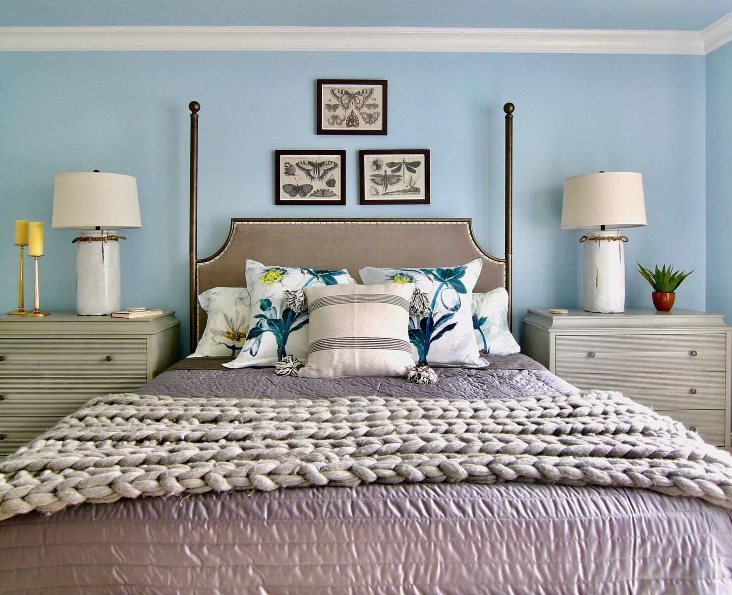
Gretchen Black: Aqua has been a favorite color of mine for as long as I can remember. It reminds me of the ocean and the beach.

SJ: Do you use color as a dominant role in your designs or as an accent?

GB: I use color as an accent in a space, keeping the background fairly neutral.

SJ: How do you feel about matching colors in a room?

GB: I love using colors that compliment one another but they don't necessarily have to match.

HAVE NOTHING IN YOUR HOME THAT YOU YOURSELF DON’T FIND BEAUTIFUL OR USEFUL
— GRETCHEN BLACK

SJ: What color represents your personality?

GB: Any shade of Blue.

SJ: What color comes to mind when you talk about:

Your favorite City .......

GB: Charleston is my favorite city and hues of green come to mind because I love all the beautiful live oak trees.

The House You Grew Up In .........

GB: Blue. We had blue shutters on our traditional cape cod style home that my parents built.

Last Fabulous Dinner You Had ........

GB: Shades of red because I love making my husband's family's yummy homemade marinara sauce over lamb.

Your favorite Flower .......

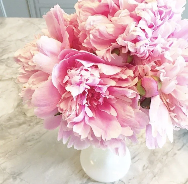
GB: Pink Peonies. I wish their bloom time was longer. They are my favorite.

Your favorite season ......

GB: Summer. The skies are bluer and I love hanging by the pool.

Your Favorite Art ......

GB: Irises by Vincent Van Gogh. I love all the shades of blues and greens.

Your Favorite Room in Your Home .....

GB: Family room because it has white shiplap walls with pops of navy and aqua and lots of live plants.

Your Favorite Beauty product ....

GB: Matte black mascara. I try not to ever leave the house without at least having mascara on.

Your Favorite Article of Clothing ......

GB: Shoes. All colors and styles. A girl can conquer the world in a great pair of shoes.

SJ: Name a color you never use?

GB: Purple. I know it's ironic since it's the color of the year!

SJ: Name a color you use frequently?

GB: Gray, it's my go to wall color.

SJ: If you could pick a name for a color what would it be?

GB: Tranquil because all spaces you live in should give you a sense of peace and tranquility.

SJ: Do you have a pet? What color reminds you of him/her? Do you have a nickname for this pet?

GB: Our golden doodle Hudson is the color of the beautiful beaches along 30A in Florida.

SJ: What is the Now Neutral?

GB: Gray. I think it is still going strong.

I LOVE MODERN DESIGN WITH A TWIST OF VINTAGE STYLE
— GRETCHEN BLACK

SJ: What is your prediction for the next big color trend?

GB: Navy Blue

SJ: What are the best color combinations?

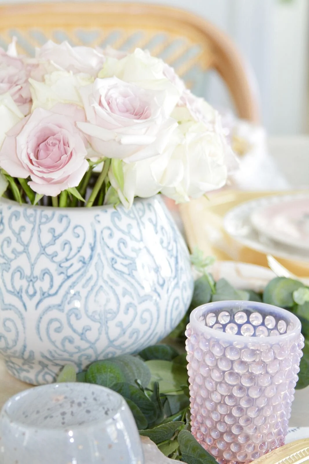
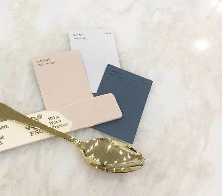
GB: Aquas and grays and then navy and blush.

SJ: Best advice when it comes to picking paint colors?

GB: Hire an expert. There are so many factors that come into play when choosing the right color for a space. A color that looks great in your neighbors home may not look the same in your home. Lighting, windows, flooring all can change the way a color looks in your space.

FOLLOW GRETCHEN ON IG @GretchenBlack
WEBSITE: www.greyhousedesign.com

Hue Are You? with Kim Hoegger

Hue Are You?

Designer Spotlight: Kim Hoegger

Our next guest has it all: an interior design business - Kim Hoegger Home, a custom textile line - Kim Hoegger Textiles and a retail store Studio McKinney in Dallas, Texas. Her sophisticated cottage style can be seen both in her design work as well as her fabric and wallpaper line. I was thrilled to be able to view her work in person at the amazing Julian Price Showhouse in Greensboro NC sponsored by Southern Home Magazine. Kim stole the show with her breakfast room and traveler's room both rich in textiles, antiques and color. I can't wait to hear how she pulls it all together with color!

Susan Jamieson: What one color represents your design style?

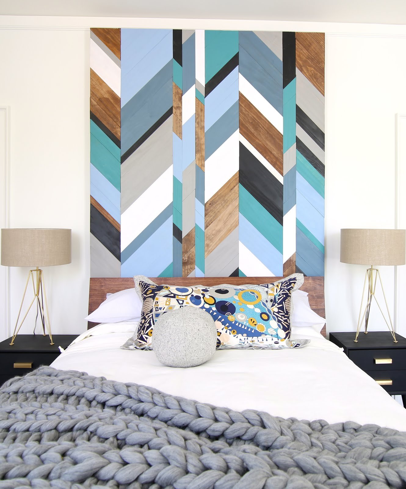
Kim Hoegger: Definitely blue, as it seems to be the one color that I am constantly drawn to in many of my projects and my textile designs. I think that stems from my love of being near the water. There's nothing quite like the serenity of blue in the water and sky, hearing the waves crashing against the rocks and feeling the breeze coming off the water.

SJ: Do you use color as a dominant role in your designs or as an accent?

KH: I would say as a general rule, color plays a dominate role in my overall design concept of a space. I can't imagine a room without color even if it's just subtle color that brings the outside in. I think color infuses personality and energy. It's a necessary element to be considered in every room. I also consider white to be a color that can standalone as the dominant color within a space. In design, a white room is equally as pleasing as one full of color. I think it is important to be intentional about adding in the right textures and furniture pieces to create a layered and captivating environment.

SJ: How do you feel about matching colors in a room?

KH: I would say that most of my work reflects a love of colors that blend well together. I generally have a dominant color palette within a room and then use shades of the same color to blend patterns. I find that staying in the same color palette delivers serenity and calm. Both of which I find to be very important considerations for the way we live today – we need a refuge. I think that a simple, consistent color palette delivers that. A good example of this is the Traveler’s Room and Bath that I recently designed for the Hillside Designer Show House featuring the Julian Price House of Greensboro, NC. The rooms were especially small but the size was actually helpful in achieving the overall design concept for the space. I wanted the guest room and bath to provide the guest with a relaxing experience – to give them a place to unwind and recharge. I chose a simple palette of serene blues and browns to deliver the serenity that I was looking for. I selected a beautiful Thibaut wallcovering and coordinating fabric and applied the wallcovering to the walls and ceilings of both the bedroom and the bath – doing so encapsulated the room and created a breathtaking jewel box effect. The room hugs you and takes you away to a very quiet and personal place. French antiques added warmth and a well-traveled ambience to the room. I think it worked really well and a soothing, serene guest experience was achieved.

LIVE PASSIONATELY, CREATIVELY AND BEAUTIFULLY
— KIM HOEGGER

SJ: What color represents your personality?

KH: Oh that’s a tough one – but I would have to say blue again. It’s just so many things to me – it makes me feel happy and it provides calm. Who doesn’t need happy and calm, lol.

SJ: What color comes to mind when you talk about:

Your favorite City .......

KH: Paris. And for some reason I always think of pink peonies, pink roses and pink macaroons.

The House You Grew Up In .........

KH: The house I grew up in, wow, that takes me back. I would say Orange and Pink. I remember my Mom being very “on trend” with color and fashion and our home always seemed to have the latest fashion in wallpaper. I specifically remember this very large scaled floral wallpaper in the main bathroom with orange, yellow and pink mod looking flowers. I loved that paper! And maybe more impressive was the pink tile that she paired it with! Fab job Mom!

Last Fabulous Dinner You Had ........

KH: So many wonderful dinners to recall but the one that comes to mind first is a very special dinner with friends on my first night in Venice. The color would have to be green. We dined in a magical place just off the main palazzo with so many people buzzing outside – the walls were handpainted in beautiful shades of green with glorious floral motifs strewn about that seemed to dance with the music that played outside. It was a magical evening.

Your favorite Flower .......

KH: Roses in every color.

Your favorite season .......

KH: Ahhh, Summer. Blue.

Your Favorite Art ......

KH: My favorite art pieces are always vintage oils so they are usually darker with warm browns. Muted shades of all colors.

Your Favorite Room in Your Home .....

KH: The Kitchen. A good kitchen always has some crisp, clean white.

Your Favorite Beauty product ....

KH: Dior Makeup - Classic Black.

Your Favorite Article of Clothing ......

KH: Blue jeans and tennies because they go together like peanut butter and jelly. Blue and white.

SJ: Name a color you never use?

KH: Red

SJ: Name a color you use frequently?

KH: Aside from blue, I love white. And I love it because it’s fresh and crisp and provides a beautiful gallery like backdrop for so many projects. I love to do lake and coastal projects where we paint the walls a crisp white and the water seems to reflect off the walls. It’s beautiful.

SJ: If you could pick a name for a color what would it be?

KH: I think I would like to name a color after one of my favorite foods – Truffle Fries. LOL. Doesn’t that sound like a pretty color? Sounds delicious!

SJ: Do you have a pet? What color reminds you of him/her? Do you have a nickname for this pet?

KH: Yes, we have two dogs in our family. We love our dogs. Boss is a beautiful yellow lab and he’s the happiest and most loving guy. When I think of Boss, I think happy and yellow is such a happy color. Nick is our King Charles Cavalier. He is supposed to be regal and refined but honestly, he grew up chasing squirrels with Boss and he thinks he’s a lab! So, he isn’t so regal anymore as he would rather be chasing squirrels than sitting at your feet. But when I think of Nick, I do still think of a more regal color like black as he is still very regal and refined when he sits at your feet after a long day of chasing squirrels.

SJ: What is the Now Neutral?

KH: I think we are seeing all shades of blue as neutrals today, particularly navy. I see it used like black and grays have been in recent years. You see it popping up on kitchen cabinets, furniture pieces, rugs and even art. It’s a great neutral but it’s also a great accent color too!

SJ: What is your prediction for the next big color trend?

KH: While at High Point Market this past week, I noticed a lot of blue – but most often I noticed a very pale blue being shown in lamps, rugs, and wallpapers. I even noticed the same pale blue in the antiques that I ran across in the Antique and Design District. I also noticed it being paired with beautiful antique brass and foiled gold. Very special.

WHAT I LOVE MOST ABOUT INTERIOR DESIGN IS CREATING BEAUTIFUL SPACES THAT BRING JOY TO THOSE THAT LIVE IN THEM. I LOVE CREATING HOMES
— KIM HOEGGER

SJ: What are the best color combinations?

KH: The best color combinations are those where the colors were meant to be used together. I am all for an eclectic room and throwing in unexpected things but even an eclectic room has to have balance and continuity. Use a color wheel from any local art supply store – it’s like what you learned in grade school art class – certain colors work well with other colors. And some colors really don’t work well together at all! It’s elementary.

SJ: Best advice when it comes to picking paint colors?

KH: My best advise about choosing paint colors would be to do some research on undertones and be aware of what colors actually make up the color that you are considering. Does your paint have a black base or a green base? Does the white have a blue or pink undertone? Undertones make all of the difference in the world. Educate yourself on what makes a great color so that you don’t paint an entire room with a white that has a green undertone when you needed one with a blue undertone. Nothing ruins a room quite like the wrong paint color.