Hue Are You? with Jason Oliver Nixon and John Loecke of Madcap Cottage

Hue Are You?

Designer Spotlight: Jason Oliver Nixon and John Loecke of Madcap Cottage

When it comes to color and pattern mix, there can be no other dynamic duo that does it better than Jason Oliver Nixon and John Loecke of Madcap Cottage. Inspired by a European mix of styles, their interiors evoke a sense of past but are filled with bold yet unique color choices perfect for today's clients. Interiors from New York to London, products from Robert Allen to HSN, a published book, "Prints Charming" and a new Madcap store and Headquarters in High Point North Carolina, this duo is all about style and design. I am thrilled to present you with a small glimpse into their world of color.

Susan Jamieson:  What one color represents your design style? 

Jason Oliver Nixon and John Loecke: John and I are crazy for English-inspired shades of green, we love bringing the great outdoors within. If it works in your garden, it will work in your home. Green is the perfect neutral upon which to layer and build.

SJ: Do you use color as a dominant role in your designs or as an accent?

JN/JL: Color, prints, and patterns are Madcap Cottage signatures. As Mae West once said, "It's better to be looked over than overlooked." If you want a beige living room with taupe accents, we aren't your people.

SJ: How do you feel about matching colors in a room?

JN/JL: Never match, mix. It's more fun to run various shades of, say, green or blue across a room.

CLASSIC COLONIAL 2005

 
JASON AND I ARE STORYTELLERS.
— JOHN LOECKE
 

SJ: What color represents your personality?

JN/JL: Fowler Pink makes anyone look good, and what's not to love about that.

SJ: What color comes to mind when you talk about:

Your favorite City ....... London. Cooking Apple Green.

The House You Grew Up In ......... Jason: Pale yellow. I grew up in a 1920's Mediterranean that had wonderful yellow stucco walls. John: I grew up in a Cape Cod-style home in Iowa, and I remember the inviting yellow exterior.

Last Fabulous Dinner You Had ........ Blue and white. It was a fabulous dinner upon the porch at a friend's farm in rural Virginia, all blue-and-white china and flickering candles.

ROBERT ALLEN FABRICS

Your favorite Flower ....... Deep Pink. Peonies.

Your favorite season ...... Green. Spring.

Your Favorite Art ...... Pink. Painting by Anglo-American editor /artist Fleur Cowles with her signature rose motifs.

Your Favorite Room in Your Home ..... Deep green. Our kitchen at the House of Bedlam in High Point , North Carolina.

Your Favorite Beauty product .... Green. Garden-scented fragrances from Jo Malone.

Your Favorite Article of Clothing ...... Pink. Our ubiquitous polo shirts from Bonobo's.

SJ: Name a color you never use?

JN/JL: Maroon. Yucky.

SJ: Name a color you use frequently?

JN/JL: Green.

SJ: If you could pick a name for a color what would it be?

JN/JL: Cherries Jubilee Flambe.

 
GOOD DESIGN SHOULD BE BESPOKE AND YET RELAXED AND EASY.
— JASON NIXON
 

SJ: Do you have a pet? What color reminds you of him/her? Do you have a nickname for this pet?

JN/JL: We have four pound rescues, Jasper, Weenie, Amy Petunia, and Cecil. A Boston Terrier/Boxer mix and three pugs. They love scampering about the garden, so I think of green and pink.

Photo from One Kings Lane

SJ: What is the Now Neutral?

JN/JL: Green.

SJ: What is your prediction for the next big color trend?

JN/JL: We don't believe in trends. We strive for timeless.

SJ: What are the best color combinations?

JN/JL: Green and anything. Especially yellow.

SJ: Best advice when it comes to picking paint colors?

JN/JL: Have fun, and don't over analyze.

Website: https://madcapcottage.com/

Instagram: www.instagram.com/madcapcottage

Book: https://www.amazon.com/Prints-Charming-Madcap-Cottage-Absolutely/dp/1419726641

Bridget Beari Color Rule #1 - Color Accents

 I am starting a new series called Bridget Beari Color Rules for Paint Tip Tuesday! Although I am not a believer that design should be restricted by rules, my readers and clients always ask for guidelines in terms of choosing colors so I have decide to write them down. Here we go.....

#1 Use Unexpected Color Accents

If you are afraid to paint a whole room a bold color, try using accents of bold colors behind a bookcase, on a ceiling or on door. 

Here I used Bella No. 41 to create a bold statement within the white bookcase ( Snowball No. 2). The accessories stand out with this color choice. 

Check out all our 200 colors at Bridget Beari Colors or at the Bridget Beari Home Store located at 1528 West Cary Street in Richmond, Virginia. Call or email if you need help with color. 804-967-3103 or info@bridgetbeari.com. We ship nationwide and have sample pots and fan decks available. 

Sidebar:

 Bella is a cat ( no longer with us) She showed up in our yard with her baby and she decided to stay. We named her Bella from the movie the Croupier which is French for card dealer. The heroine was Bella and her boyfriend was Jacques-O. She was brave and bold with a perfect purr! 

Snowball was a cat from my childhood. Obviously white

Bridget Beari Color Rule #1 - Color Accents

I am starting a new series called Bridget Beari Color Rules for Paint Tip Tuesday! Although I am not a believer that design should be restricted by rules, my readers and clients always ask for guidelines in terms of choosing colors so I have decide t o write them down. Here we go.....

#1

Use Unexpected Color Accents

If you are afraid to paint a whole room a bold color, try using accents of bold colors behind a bookcase, on a ceiling or on door.

Here I used Bella No. 41 to create a bold statement within the white bookcase

( Snowball No. 2). The accessories stand out with this color choice.

Check out all our 200 colors at Bridget Beari Colors or at the Bridget Beari Home Store located at 1528 West Cary Street in Richmond, Virginia. Call or email if you need help with color. 804-967-3103 or info@bridgetbeari.com. We ship nationwide and have sample pots and fan decks available.

Sidebar:

Bella is a cat ( no longer with us) She showed up in our yard with her baby and she decided to stay. We named her Bella from the movie the Croupier which is French for card dealer. The heroine was Bella and her boyfriend was Jacques-O. She was brave and bold with a perfect purr!

Snowball was a cat from my childhood. Obviously white!

Hue Are You? with Michele Alfano

Hue Are You? 

Designer Spotlight: Michele Alfano

Today our guest is New York designer, Michele Alfano. She is the founder and creative director of Michele Alfano Design, a collaborative studio focused on the nexus of interior design and technology. Michele was trained as an architect and is recognized for her architectural eye and dedication to creating custom interiors and architectural details for each project. Her architectonic signature reveals a crisp modern point of view fused with an imaginative use of color, form, pattern and texture producing visually sleek, masculine sophistication. Let's hear her views on color .....

Susan Jamieson: What one color represents your design style?

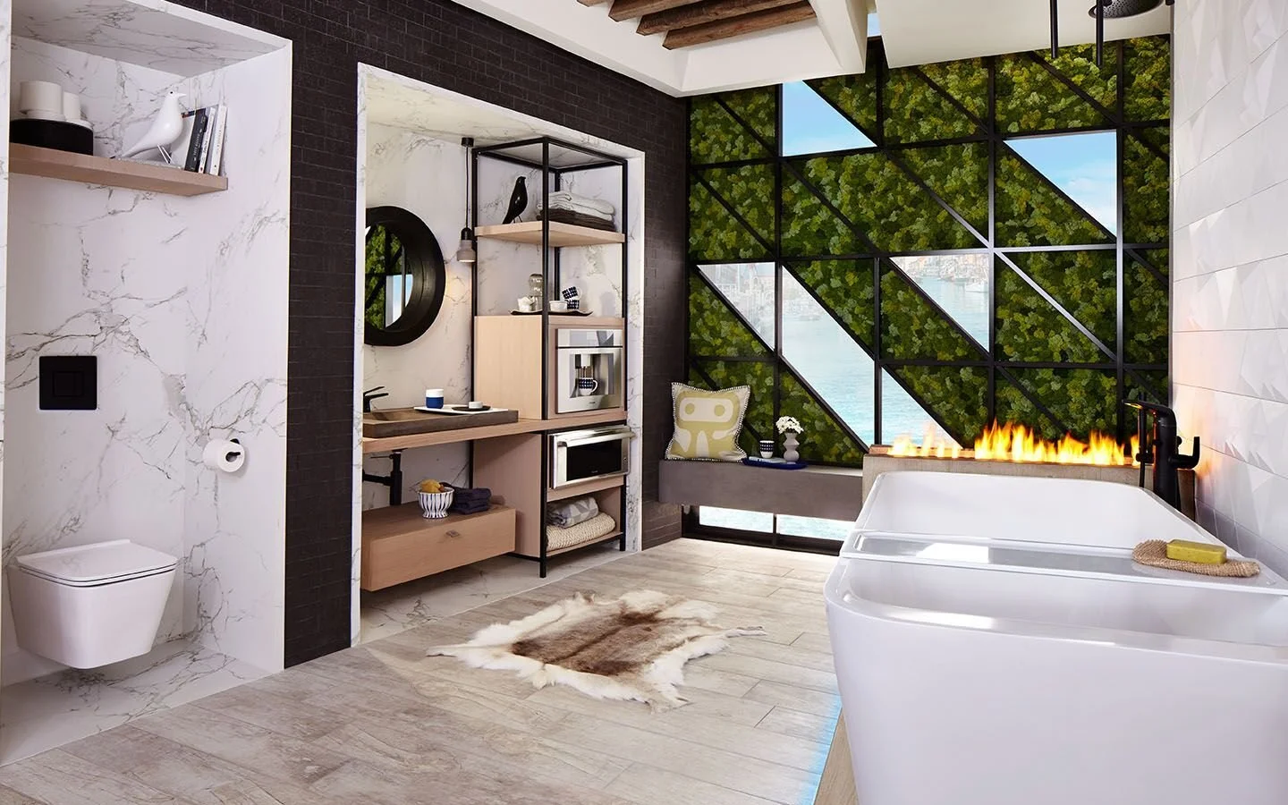
Michele Alfano: Throughout my career, I have always been interested in the human experience... how we behave and connect to our living spaces. I believe that we are all animals and need connection to our living systems so I have always been drawn to the color green. I try to ground my spaces with natural, crafted elements. In my bathroom design for DXV below, all the senses are touched in this space with the use of nature, water, and fire. The moss-window wall brings nature into the bathroom... imagine someone sitting on the floating concrete bench sipping a cup of coffee, immersed in nature and gazing at the water beyond.

SJ: Do you use color as a dominant role in your designs or as an accent?

MA: I typically use color as an accent. In my farmhouse modern kitchen design, the island is celebrated with a blue slate color so my client becomes center stage as she cooks and bakes.

SJ: How do you feel about matching colors in a room?

MA: Honestly matchy matchy makes me cringe... My childhood bestie always liked to match her shirt to her socks .. ughh. Have a little fun, mix and match whether its fashion or design.

SJ: What color represents your personality?

MA: Well, black.. even though it is not considered a color but absorbs all the colors of the visible spectrum. I tend to be a bit mysterious to some and think about things very deeply. I also like to bring in a pop of black in my spaces like my bathroom design below which has a touch of black in the faucet and the vanity.

PEOPLE AND THEIR CONNECTION TO SPACE HAS ALWAYS BEEN THE FOREFRONT OF MY WORK
— MICHELE ALFANO

SJ: What color comes to mind when you talk about:

Your favorite City ....... While in architecture school, I studied abroad for a semester in Barcelona. I fell in love with the city, especially with the work of Antoni Gaudi. Especially on the facade of Casa Batllo, made of broken ceramic tiles that start in shades of golden orange moving into greenish blues.

The House You Grew Up In ......... When I think about the house I grew up in, I think about our living room's rusted orange couches.

Last Fabulous Dinner You Had ........ I love concoctions and this tofu and mixed vegetable Asian fusion dish was everything... from the taste to the colors.

Your favorite Flower ....... I love the texture and color of Grape Hyacinths. They really pop against my customized tub tray and white concrete tiles.

Your favorite season ...... Fall, love the change of colors.

Your Favorite Art ...... The Oaks, by Hogan. My husband and I met in New Orleans while he was planting in his garden. He invited us into his studio and I ended up falling in love with his work and purchased this piece.

Your Favorite Room in Your Home ..... My favorite room in my house is my Zen modern space. I sliced the foundation wall down in order to bring in natural light and bring the outside in.

Your Favorite Article of Clothing ...... My favorite article of clothing is my black leather jacket.

SJ
: If you could pick a name for a color what would it be?

MA: Kookamonga .... it's a word my husband made up which describes my kids when they get cuckoo.

SJ: Do you have a pet? What color reminds you of him/her? Do you have a nickname for this pet?

MA: I have a Soft Coated Wheaton terrier named Einstein or E boy. His hair reminds me of the color of champagne. Oh that face!

SJ: What is the Now Neutral?

MA: Concrete is the new Neutral. In my bathroom design for DXV, a concrete looking finish was used for the shower walls and the floating bench.

SJ: What is your prediction for the next big color trend?

MA: I saw this vanity at the 2018 Kips Bay Showhouse by Drake Anderson. I thought this combination of celadon and black was very cool. I think we may be seeing more of this combination, like celadon walls and either black or chocolate trim.

SJ: What are the best color combinations?

MA: I love the combination green with black.

SJ: Best advice when it comes to picking paint colors? 

MA: Don't be afraid of saturated dark colored walls. There is a misconception that dark walls make a small room seem smaller. I think just the opposite happens. Dark colors recede the corners of the room away and make a small room feel larger. 
Follow Michele on: 

My website: https://michelealfanodesign.com/

Instagram: https://www.instagram.com/michelealfanodesign/

Hue Are You? with Alison Habermehl

Hue Are You?

Designer Spotlight: Alison Habermehl

I am thrilled to have Canadian designer, Alison Habermehl founder of the Habermehl Design Group in Waterlloo as my guest. HDG’s Design approach is a deeply personal collaboration with each client, to interpret their taste and understand their individual and collective needs, to achieve a harmonious balance between aesthetics and functionality. Alison currently has an ad for DXV, a contemporary bath she designed, that is running in most major magazines. If you haven't seen it yet make a point to do so. The bathroom is amazing. Here we go with her views on color.

Susan Jamieson: What one color represents your design style?

Alison Habermehl: If I can only pick one, I would say white for its versatility and how it's a perfect backdrop for art and contrasting finishes.

Photo by Virginia MacDonald

SJ: Do you use color as a dominant role in your designs or as an accent?

AH: Mostly as an accent and most prominently in the art.

Photo by Virginia MacDonald

I LOVE THE CHALLENGE OF BRINGING TO LIFE MY CLIENT’S BEST ATTRIBUTES IN THEIR HOMES. IT SHOULD BE A REFLECTION OF WHO THEY ARE AND AT THE SAME TIME INSPIRE THEM TO BE WHO THEY WANT TO BE.
— ALISON HABERMEHL

SJ: How do you feel about matching colors in a room?

AH: I do like a palette that flows so you will see a repeated colour being used in my projects. I don't intentionally try to be matchy-matchy but I do prefer rooms that aren't jarring with multiple colours and patterns. Ultimately I pick colours that suit my client's taste and it's a pretty instinctual process for me.

SJ: What color represents your personality?

AH: I have more than one ... sorry. Varying degrees of blues that remind me of water. I also think black and white represents my personality for its classic and sometimes edgy look.

SJ: What color comes to mind when you talk about:

Your favorite City ....... A magical town called Asilah on the coast of Morocco. I backpacked there in 1989 and fell in love with its artistic culture. It has an annual arts festival that is now world renowned. I think of cerulean blue and chalky white for the painted doors and vibrant art on the medina walls.

The House You Grew Up In ......... We moved every few years but my favorite home was in Winnipeg, Manitoba in the 80's for its modern architecture. White, tan and deep browns are the colours I remember about that house.

Last Fabulous Dinner You Had ........ For me it's all about the company and my last fabulous dinner was a homemade frittata made by my best friend. Garnet red for all the wine we drank that evening.

Your favorite Flower ....... I don't actually have one favorite flower. For me a flower has to look beautiful in a simple arrangement just picked from my garden; whether it is Peonies, Lily of the Valley or Cherry blossom branches. I'm not a huge fan of mixed bouquets, as they feel too contrived. Soft pinky-white.

Your favorite season ...... Late summer. I take a two week holiday at my cottage at the end of August every year and love the warm days and cool nights of the late summer. Lake Huron can mysteriously change from a mineral grey colour to a tropical green-blue depending on the weather. So I think of those colours for late summer.

Your Favorite Art ...... One I bought in Palm Springs California by artist Cassandra Complex. Even though blue is the prominent colour, I think of black when I look at it for the sinister attitude it suggests. I also love Peggy Guggenheim's mind blowing art collection in Venice. It has some of my favorites artists represented with a kaleidoscope of colours.

“I DESIGN WITH AN INFUSION OF ALL THAT IS SENSUAL, CHIC AND STUDIOUSLY TAILORED.
— ALLISON HABERMEHL

Your Favorite Room in Your Home ..... I love any room that feels as comfortable for a single person as it does for many. It has to be able to adapt to the energy of each scenario and not feel fussy. I would say a well-designed family room is my favorite and it has to always have a place to put a drink.. then you know it was designed for real use , not just for show. I think white is a chameleon colour and perfect for a family room when mixed with contrasts.

Your Favorite Beauty product .... I have super sensitive skin so my go to is Cetaphil cleanser, but just to prove I am a grown up, I use a rich hand and body cream bought in Tuscany which is made from olive oil by Prima Spremitura. It has a beautiful, natural scent. I pay more for shipping than I do for the cream, but it is totally worth it. I think of Green.

Your Favorite Article of Clothing ...... My Emerson Fry navy kimono style robe with white piping. It is so beautiful I want to wear it out some night but I haven't had the guts to do it yet.

SJ: Name a color you never use?

AH: I rarely use any colour in its purist form, so there is no colour off limits really. However one of my least favorite colours is purple.

SJ: Name a color you use frequently?

AH: My main colour is white or colours used in the lightest spectrum but I love using cyan in the softest tint to the most saturated tone. Because of its complexity, it can be both fresh and sultry depending on the depth and application.

SJ: If you could pick a name for a color what would it be?

AH: Fun Question! How about Charlatan Green or Smoke and Mirrors Grey...hmm there's a theme happening here.

SJ: Do you have a pet? What color reminds you of him/her? Do you have a nickname for this pet?

AH: A Jack Russel cross called Angus who is now a senior citizen. Black and White. He has many nicknames to match his personalities, but a favorite is Stinky Pants.

SJ: What is the Now Neutral?

AH: Blush for light and Navy for dark... grey is still kicking.

DXV Bath Ad

DXV Bath Ad

SJ: What is your prediction for the next big color trend?

AH: When I was in Italy last year I saw a lot of saturated corals and teals. They're usually ahead of the game.

SJ: What are the best color combinations?

AH: Whatever looks effortless or provokes a mood. My favorite combos are: white and black for the contrast, navy and black for the sophistication , and the deepest mineral green with a hint of something warm like copper, brass or red for drama.

SJ: Best advice when it comes to picking paint colors?

AH: Know your natural and unnatural light situation and how it changes a colour dramatically depending on the time of day or the bulbs being used.

Test a patch on each wall in the room with at least two coats to see the true colour.

If you want a light colour on the walls go with the lightest version and when you want a rich saturated colour go for the darkest version... often people think you won't see the colour with either spectrum, but I find these are usually the most flattering.

Social Media Handles and Website Address:

FACEBOOK: https://www.facebook.com/habermehldesigngroup/
INSTAGRAM: https://www.instagram.com/habermehldesigngroup/
TWITTER: https://twitter.com/habermehldesign
PINTEREST: https://www.pinterest.ca/habermehldesign/
TUMBLR: https://habermehldesigngroup.tumblr.com/

WEBSITE: https://www.habermehldesigngroup.com/