Bridget Beari Color Rule #34 - Create Your Crowning Moment

Bridget Beari Color Rule:

Create Your Crowning Moment

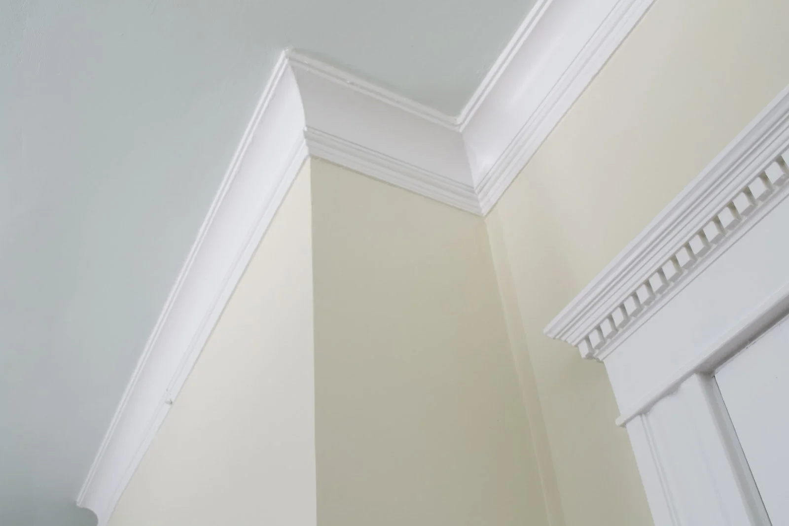
When you paint your crown a contrasting color from your walls and ceiling, you create a real statement in your room.

Dark crown attracts immediate attention and creates a graphic look. 

White trim between cream walls and a blue ceiling creates a crisp and tailored look.

Design by Bridget Beari, photo by Joe Bernado

Always use a semi-gloss finish for an even greater contrast. 

Don't forget to check out all our Bridget Beari paint colors!
Bridget Beari Colors


TIP:

This is a great tip from A Journey to a Dream blog. Take old plastic milk cartons and use a hot needle to punch holes in the top. Use as a sprinkler or watering can. 


Happy Painting…

Bridget Beari Color Rule #25 - Begin with Colors suggested by your Masonry or Roof.

Bridget Beari Color Rule:

Begin with Colors suggested by your Masonry or Roof.

This tip is directed at picking exterior colors for your home. Certain items like the roof, stone or brick on the house are usually not changing. Begin with thinking of colors that are in these structural features of the house.

For this house you would start with the brown roof color. Choose colors that are complementary to brown - yellows, creams for the walls and then accent with a color that is complementary to both the wall and roof.

Try this color from Sherwin Williams:

SW 6672 Morning Sun

Love the Grey cedar shake singles on this home. Working with the gray roof and singles allows for a great graphic contrast but could also give you the opportunity to incorporate blues, greens and blacks.

There are so many colors in a stone facades that picking an accent color can be as exciting as adding jewelry to an outfit. I look the grey blue shutters in this home.

Try this Benjamin Moore color for this shutter look! 


Tip:

As I prepare my garden and house for another open house tour in May. It's time to add the compost to the garden. I've been composting for years - kitchen scraps and all. Sometimes the compost is better than others but this layering process from Martha Stewart has really work!

1. Site Your Bin

Proper siting means easier management. Full sun necessitates frequent watering; full shade slows decomposition. The bin should be convenient to a water source.

2. Start with Brown

Begin your pile with an airy carbon layer, ideally a loose pile of fallen leaves.

3. Add Green

Aim for half as much green as brown. Too much green can lead to malodorous, slimy conditions.

4. Spring In Some Soil

A scoop of soil in the pile encourages microorganisms. Some experts recommend adding fertilizer, too, but a well-built pile will have enough nitrogen without it.

5. Repeat Brown and Green Layer

Continue layering browns and greens in a 2-to-1 ratio, ending with a layer of brown. Small pieces decompose faster, so consider cutting down any large ones.

Happy Painting…

and gardening!

Bridget Beari Color Rule #24 - Try Walking Side by Side

Bridget Beari Color Rule:

Try Walking Side by Side

If you are trying different color combos, try analogous colors. These are any three colors which are side by side on the color wheel such as yellow green, blue green, orange yellow ...... These colors work well in combinations but for best results always make one color dominate.

Blue - Green

Orange - Yellow

photo by Joe Bernado for Bridget Beari Designs 

Blue - Purple

Using analogous colors gives you that balanced feeling within a room. The colors are more serene and soothing.


Tip:

I recently bought a cast iron skillet but I had know idea how to clean. I washed it like a regular pot the first time and my friend who cooks a lot had a fit. She said I was ruining the cured surface. She gave me the secret and Martha Stewart also tells us how:

Take course salt and rub the bottom of the pan to remove any food. Rinse lightly and pat dry. This keeps all the pan cured for the next cooking session.

Happy Painting…

and Cleaning for Spring!

Bridget Beari Color Rule #23 - Get Complementary!

Bridget Beari Color Rule #23


Complementary colors are 2 colors on the color wheel that when mixed in the proper proportions produce a neutral color like grey or black.
Red = Green

Blue = Orange

Yellow = Violet

If you are looking for some pop, these can create interesting color choices in interior space.

How about Farrow & Ball 's

Calluna #270

or Farrow & Ball's

Lulworth Blue #89

Design by Janie Molster, floor by Sunny Goode from Southern Accents

or a Bridget Beari Colors

Beasie No. 33


Tip:

I found this chart on Pinterest. I'm at obsessed with china but I didn't even know that you set the table different at different meal times. I guess my mother only taught me the formal settings.

Happy Painting….

Traditional Home Cover Story

Our Atlanta project is featured on the cover of Traditional Home Magazine! Whoo Hoo! It was such a wonderful new build in the heart of Buckhead in Atlanta in collaboration with architect Peter Block and builder Shaba Derazi. We are thrilled Traditional Home picked another of our projects to publish and the cover was an added bonus!

Traditional Home Magazine Winter 2019photo by Emily Followill

Traditional Home Magazine Winter 2019

photo by Emily Followill

I thought I would share some photos that do not included Holiday decorations so you can really see the architecture and the interior design. This is actually the fifth house I have done for this amazing client but the first time I have worked with Peter Block, Atlanta architect. The collaboration was great - it was a real team effort from the selection of the lot, removal of the existing old house to the whole construction process.

Let’s start with the Exterior. A white on white French inspired home. Peter did an amazing job of capturing the light throughout the house. He is quite a master and I did my best to highlight his architectural features. I love this exterior color - Greek Villa by Sherwin Williams. It looks amazing on the stucco walls.

Photo by Peter Block

Photo by Peter Block

Here is the back of the house with the two wings - kitchen and master bedroom on one side and offices and guest bedroom on the other side.

005_z-rear-DSC_0993-grain400-55.jpg
0E13B7C8-F0F0-4A4A-AEAB-C40FBFF5E04D.JPG

The most interesting feature of the house is that you walk directly into the dining room. The dining room is also two story with the large vertical Ochre chandelier hanging between the two levels.

Entry - small.jpg

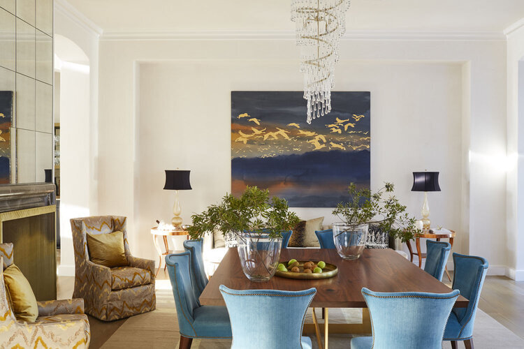
Many of the furniture pieces are custom made throughout the house. This begins with the dining room table, due to the size and the fact that it is square I had this table made from a large piece of walnut for the top and a custom metal base.

photo by Mali Azimma

photo by Mali Azimma

Photo by Peter Block

Photo by Peter Block


I added a 10ft sofa in the dining room as the perfect place to rest before or after dinner with a glass of wine but even the children love to sit there to do their homework. To the left is a custom firescreen and an antique mirrored wall above the fireplace.

stair to dr.jpg

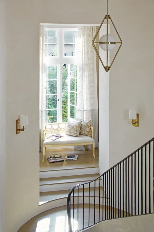
Beautiful plaster walls throughout the house.

Photo By Mali Azima

Photo By Mali Azima

Photo by Mali Azima

Photo by Mali Azima

This is the room behind the dining room that looks out to the backyard. 30 ft. ceilings, curved and plastered. We call it the Long Room - Gorgeous! Another custom fire screen and iron doors with curved tops. The high gloss black bar with the custom brass center cabinet is peaking out over in the right corner.

Photo by Mali Azima

Photo by Mali Azima

Photo by Mali Azima

Photo by Mali Azima

The kitchen is a beautiful space with the upper windows, raised fireplace and white oak cabinetry. It is filled with light as well as functionality.

Photo By Mali Azima

Photo By Mali Azima

I love mixing materials like I did here in the kitchen - white oak, plaster, white gloss, stainless drawer fronts, and marble. It is one of my favorite kitchens.

Photo By Mali Azima

Photo By Mali Azima

Photo by Mali Azima

Photo by Mali Azima

On the left side of the house are his and her offices. Can you guess which is which?

Photo by Mali Azima

Photo by Mali Azima

I love designing bookcases and built-ins. Each has its specific purpose and look.

Photo By Mali Azima

Photo By Mali Azima

The powder room is quite a gem with the vanity and the floral mural wallpaper. Even in the fixtures we have mixed antiques with modern fixtures. I love the mix!

Photo by Mali Azima

Photo by Mali Azima

The master bedroom is soft and serene with fully blackout curtains for a restful nights sleep.

Photo by Mali Azima

Photo by Mali Azima

Photo by Mai Azima

Photo by Mai Azima

The master bath walls are filled with this Tabarka silveer metallic fishscale tile.

Photo by Mali Azima

Photo by Mali Azima

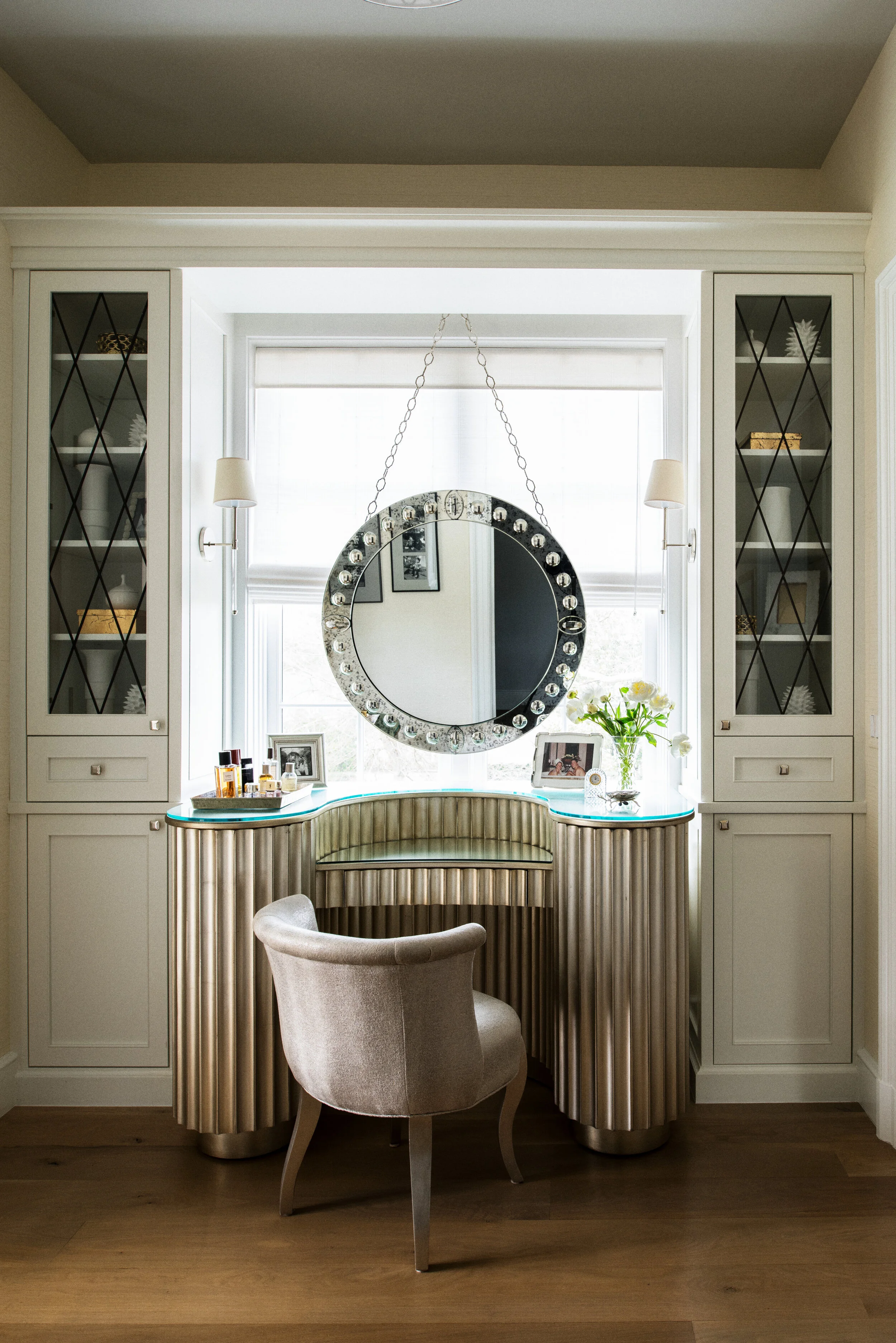
Another custom piece was this vanity I designed. The curved towers open to hold all of the clients makeup, and hair equipment.

Photoby Mali Azima

Photo by Mali Azima

Dressing.jpg

The children’s rooms: Bridget Beari Color - Sugar high gloss doors!

Kanna.jpg

A custom bunk bed with a Bridget Beari Color- Inka Dinka in high gloss!

William - small.jpg

The house even has a pool table, bar area in the basement. These built-ins slide to hide the liquor and reveal art on the side walls.

Photo by Peter Block

Photo by Peter Block

I hope you have enjoyed our sneak peak behind the scenes of the Traditional Home story and a glimpse into one of our favorite projects of 2019!